The fonts of the 2026 World Cup
The 2026 World Cup isn't over yet, and aesthetically, it's already one of the best ever. Brands have worked on their jerseys with an obsession for detail, and the most underrated is also the most enduring: the font of the numbers.
Something we all do. When we remember a legendary jersey, we remember the colors, the main sponsor, the pattern. We almost never focus on the typeface, yet that's where a kit's personality lies.
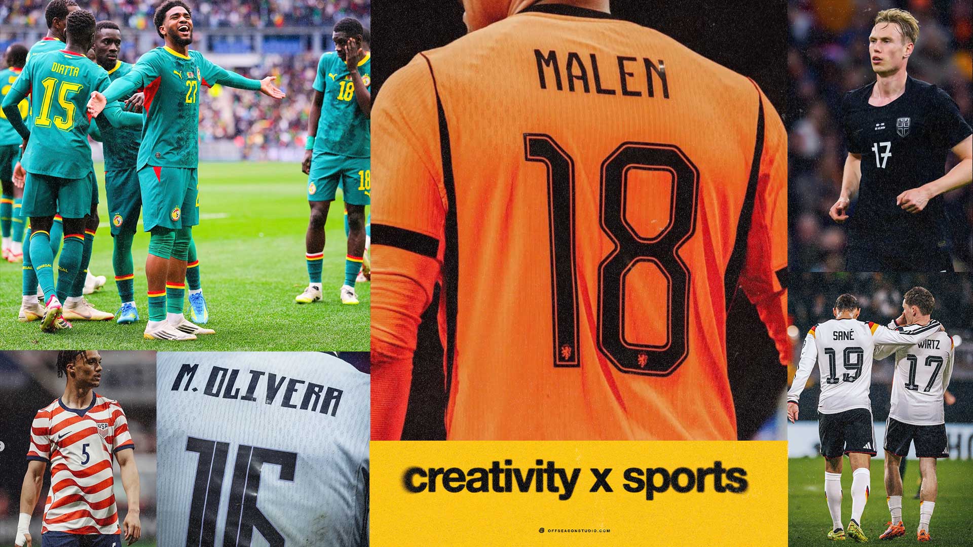
The number is the largest, most recurring, and often most photographed element of a jersey.

The rules of the game (yes, even fonts have them)
We know that the real design work begins with the constraints. FIFA has its own official font family for tournament communication, called FWC 2026, but it doesn't impose a single font on the national teams. It allows for freedom, but within a precise framework: each number must be between 25 and 35 cm high and between 2 and 5 cm wide. The surname must be 4 cm from the number, and between 5 and 7.5 cm high.

The Uruguay Case
The standout feature is the font Nike created for Uruguay. Sharp shapes, a strong aesthetic, elegant by a line that splits each number in half. It's Art Deco, and the inspiration likely comes from the inscriptions on the Torre de los Homenajes at the Estadio Centenario in Montevideo.

This is the level of the game. Not just a legible number, but one that brings to mind the architecture of a 1930s stadium. A design that tells the story of a country, not just a team.

Three brands, three philosophies
The paths diverge sharply. Nike opts for geometric and raw designs: in addition to Uruguay, the same approach can be found on Norway and the France home kit. Adidas, on the Trefoil away kit, opts for linear lines but renders them three-dimensional with a play of hatching that adds depth. Puma also insists on a three-dimensional effect.


And then there's the opposite trend. While geometry dominates, some go soft: Adidas does so on the home kits of Argentina, Colombia, and Japan.

Why such detail matters so much
Fonts don't carry the same weight as a jersey for a fan. They often go unnoticed. But they're exactly the kind of element you bring up, years later, to explain why a kit was beautiful. That's the nature of well-done graphic design: you don't notice it when it works, you recognize it when it lasts. The font shapes the identity of a jersey and enhances its character, silently, until one day it becomes the first thing we mention.

What to take away
One: constraints are not the enemy. FIFA give limits for functionality, but these limits do not affect creativity.
Two: detail is positioning. Uruguay didn't choose "a beautiful font," they chose their own history translated into typography.
Three: design for memory, not for launch. The jersey sells today, the font wins in ten years.
Links. The rest of the week
One story at the center, but it wasn't the only thing that happened. A few pointers for anyone who wants to go further:
Germany, Nike, and the end of an era — Götze teases the new German kit: after 1972, the longest-running federation-and-adidas partnership ends. (nss sports)
Athletes are the new creative directors — The Business of Sports: jersey searches up 652% in 5 weeks; players distribute culture better than any brand. (The Business of Sports)
SoccerBible's "Channel 26" — an entire creative channel about how this World Cup is seen, felt and remembered. (SoccerBible)
The La Liga 2017-18 font lives again — adopted by Uzbekistan for its World Cup: proof a good typeface doesn't expire. (nss sports)
The evolution of the Erreà logo — a clean case study in graphic synthesis over time, from monogram to double rhombus. (Erreà)
The logo became the event — 7,000 people paid a dollar to see the Timberwolves' new mark (last draft's angle, archived here). (NBA.com)