airoh helmets
rebranding airoh.
project overview
We’ve been asked for facing a big challange, to find the next graphic symbol that identifies the world wide known company Airoh Helmet.
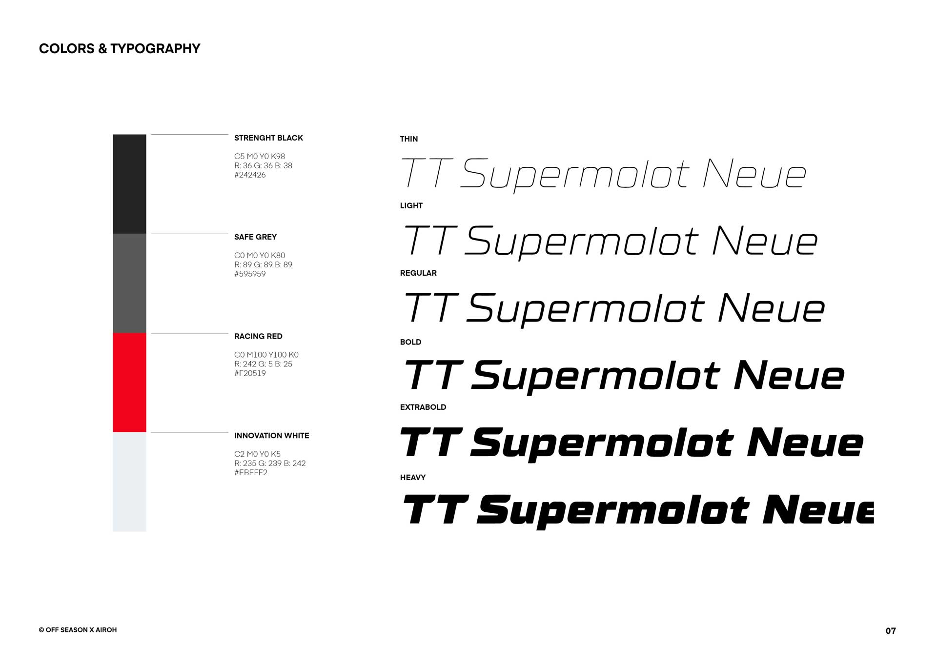
We came up with this project, a complete rebranding of the company, starting from its Brand Identity and Logo Design.
deliverables
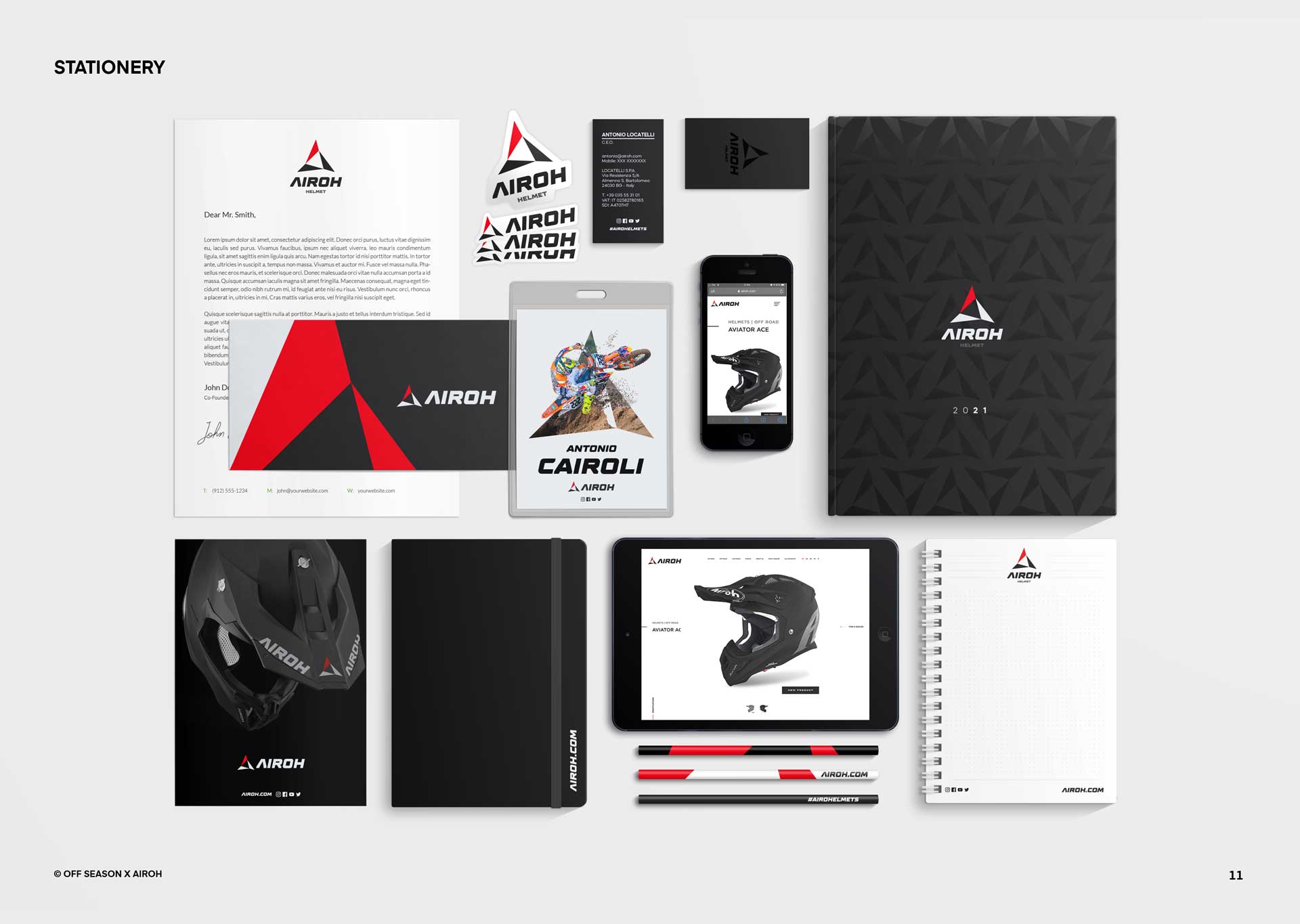
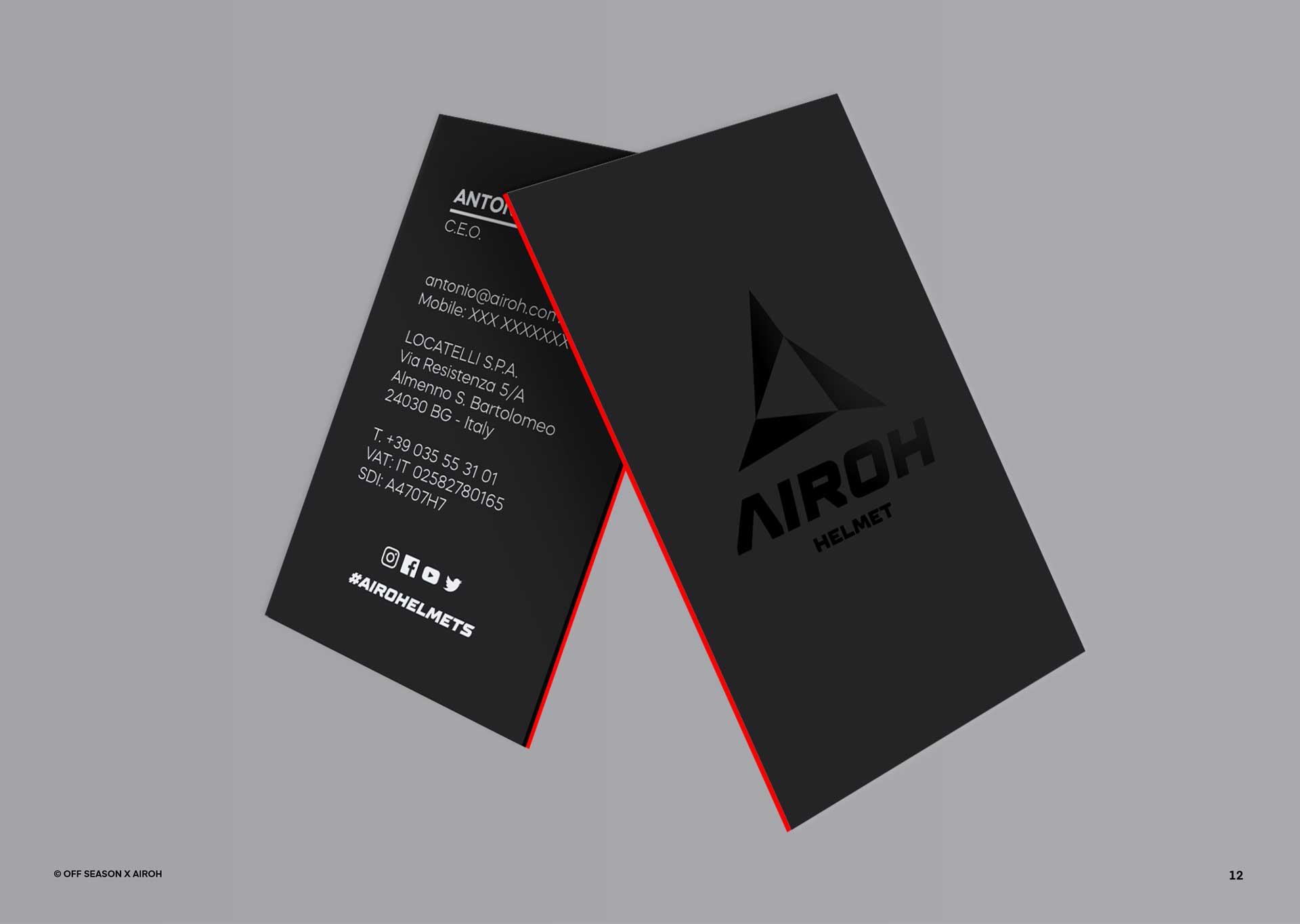
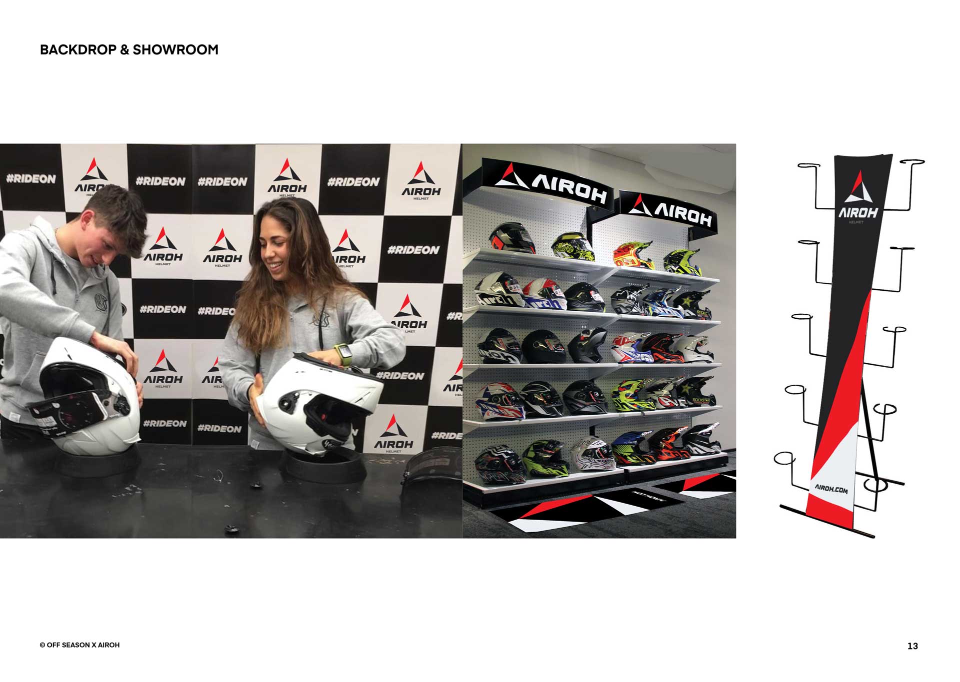
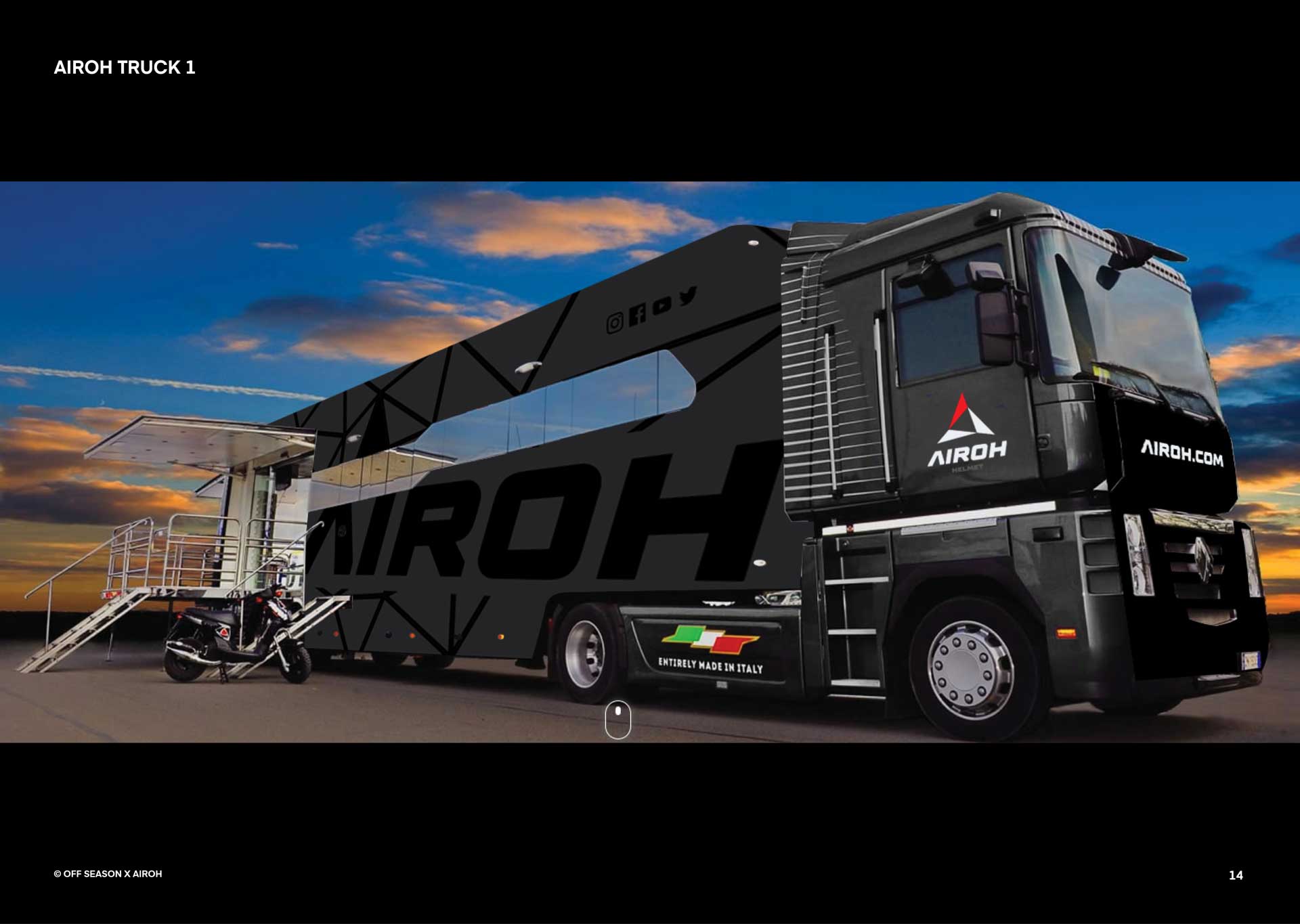
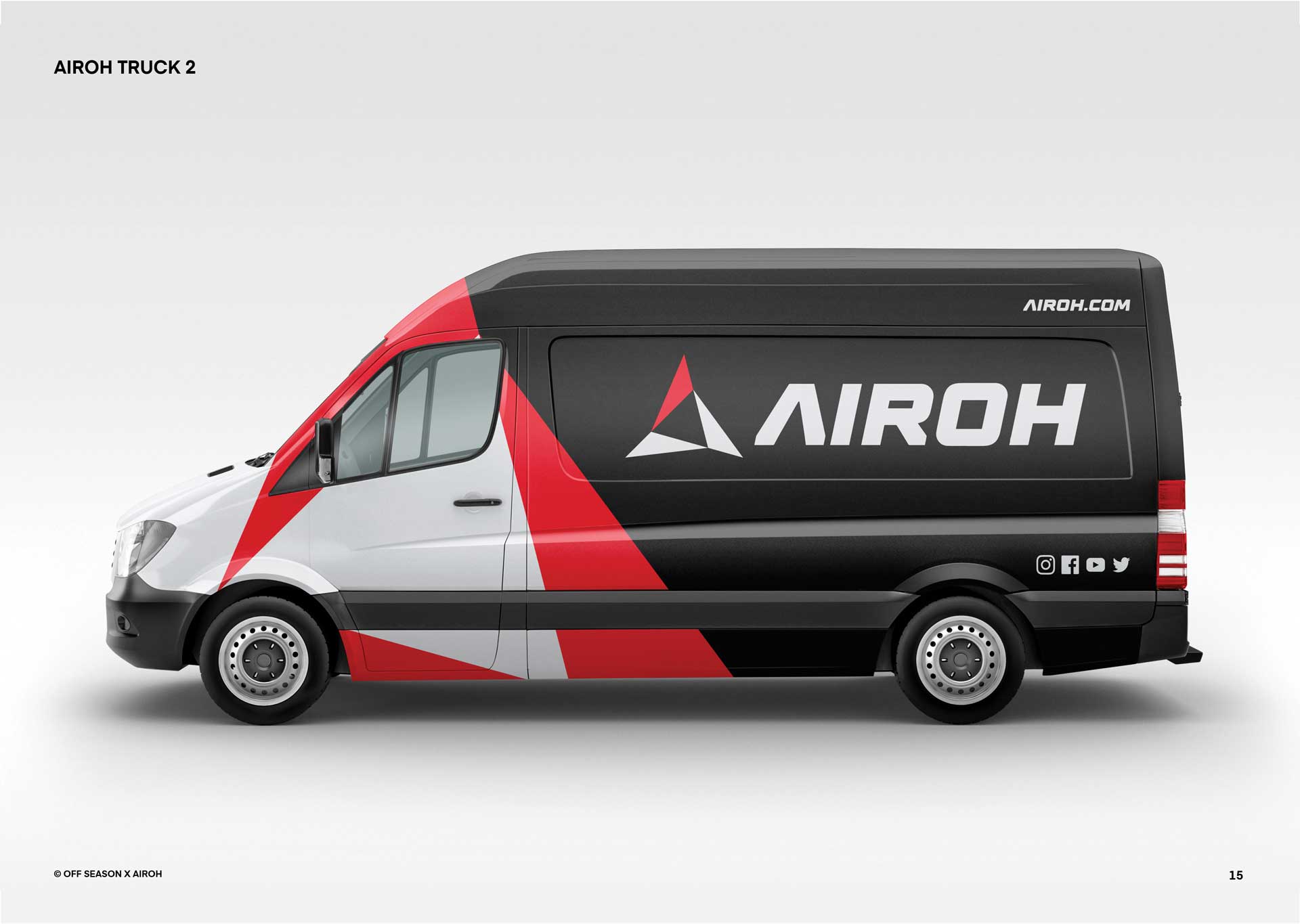
- brand identity
- graphic design
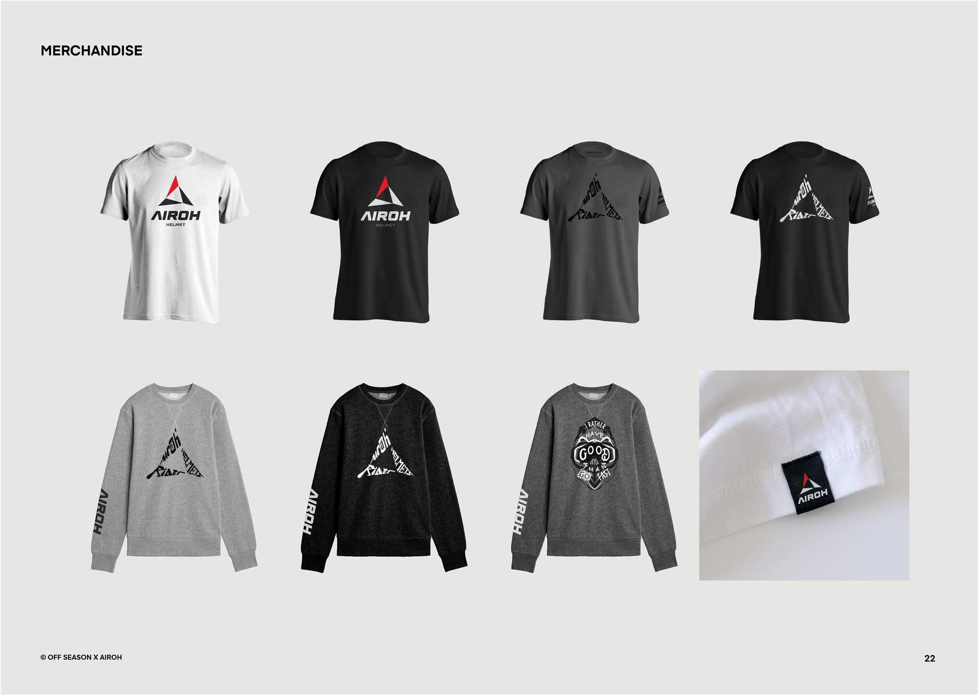
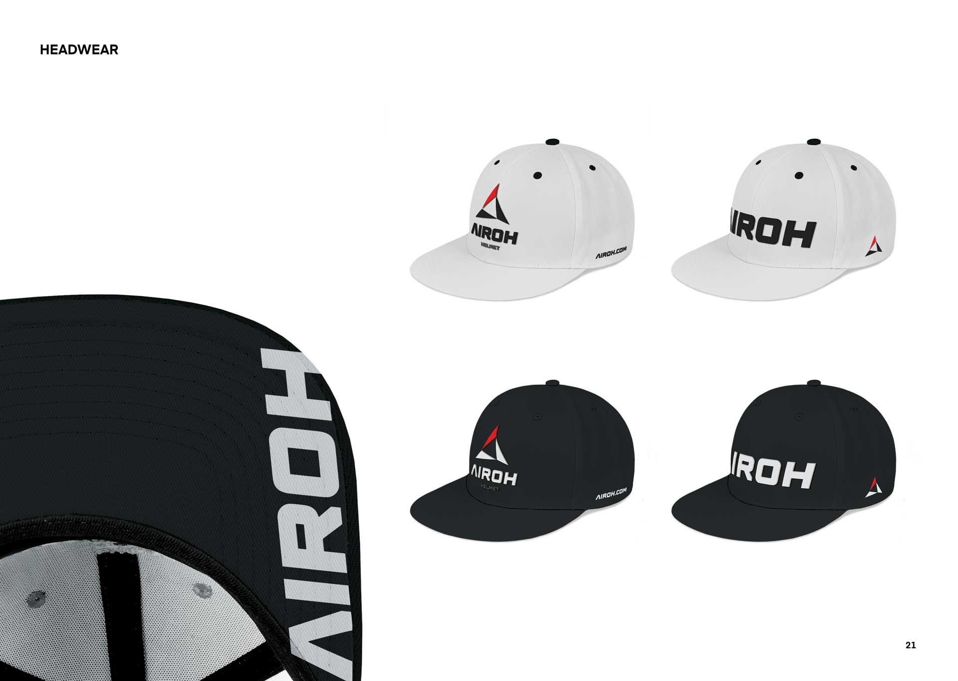
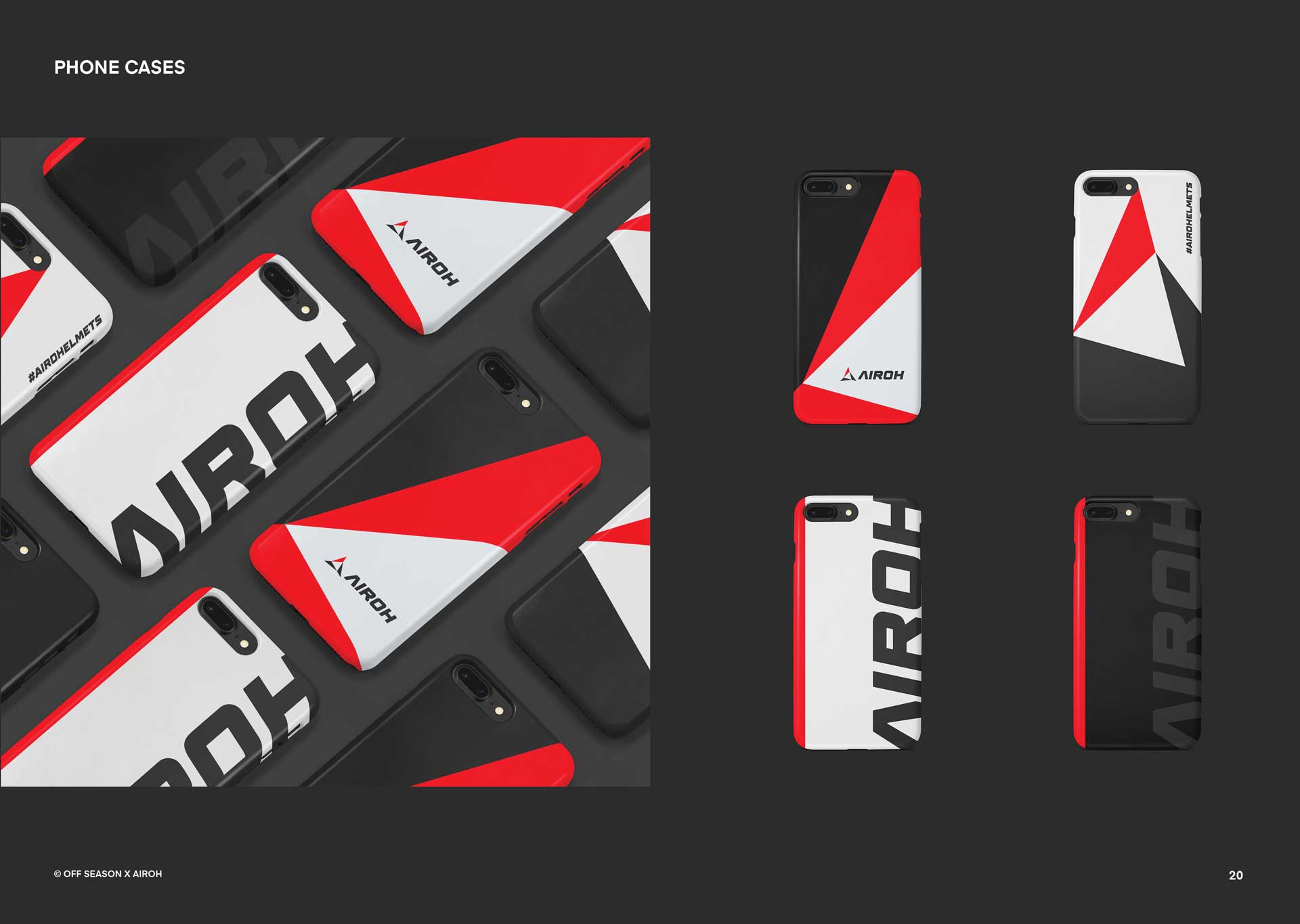
- merchandising design
challenge
It was at EICMA 2019 when we met with the management of Airoh Helmets, they immediately asked us what we thought of the current logo and to find a new solution for their entire brand identity.
They were encountering some problems and were looking for a solution that could unify their brand under one functional system.
approach
It must be said that this is our favorite kind of project and we didn't wait a moment to start looking for a concept that could best communicate the philosophy behind an Italian excellence like Airoh.
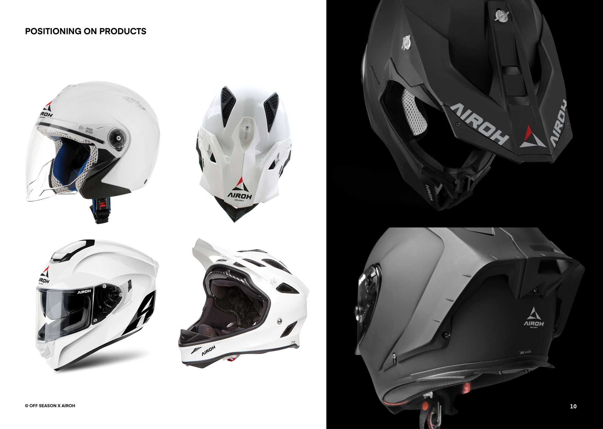
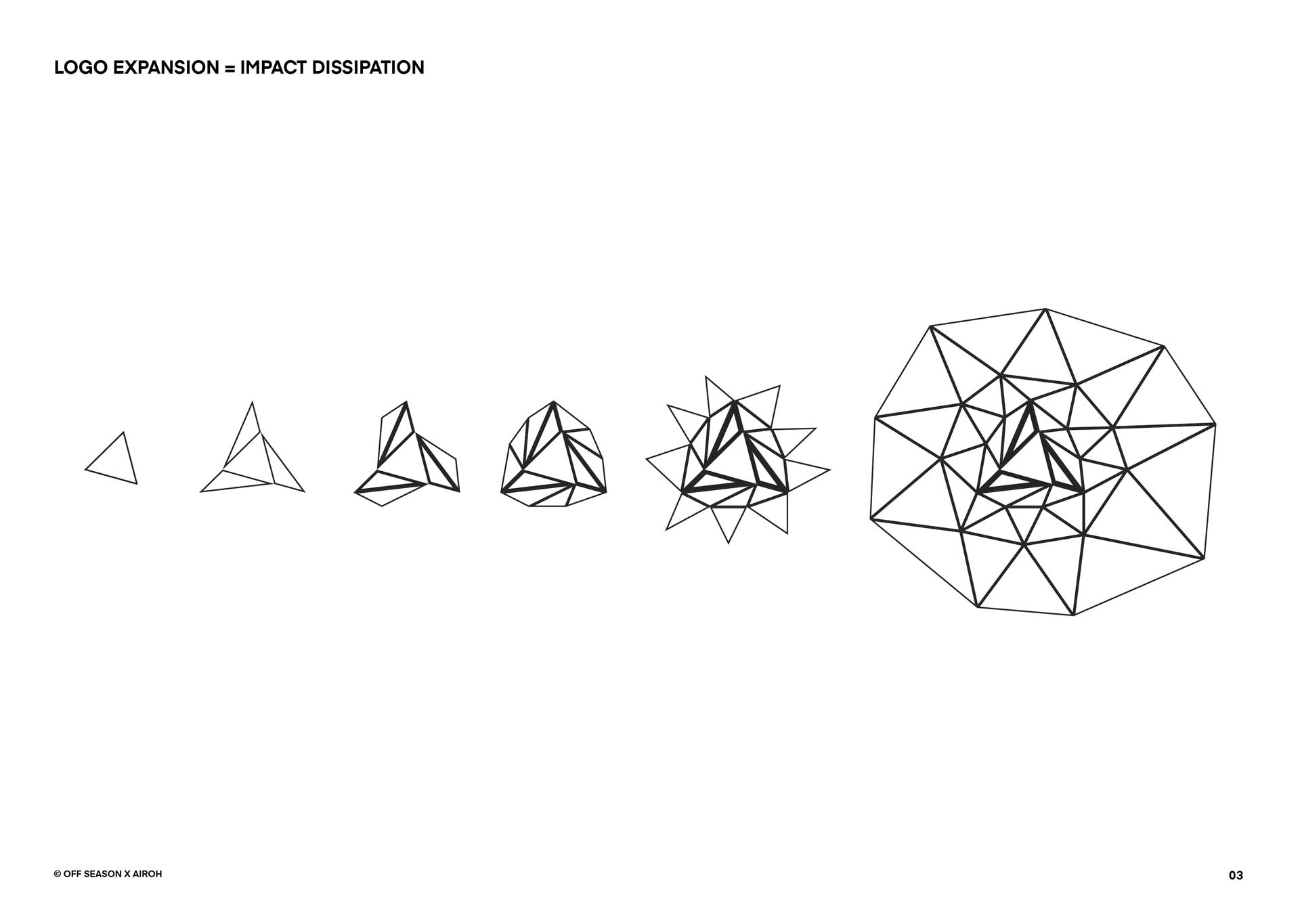
We designed around the concept of "impact dissipation", key dynamics of motorcycle helmet function.
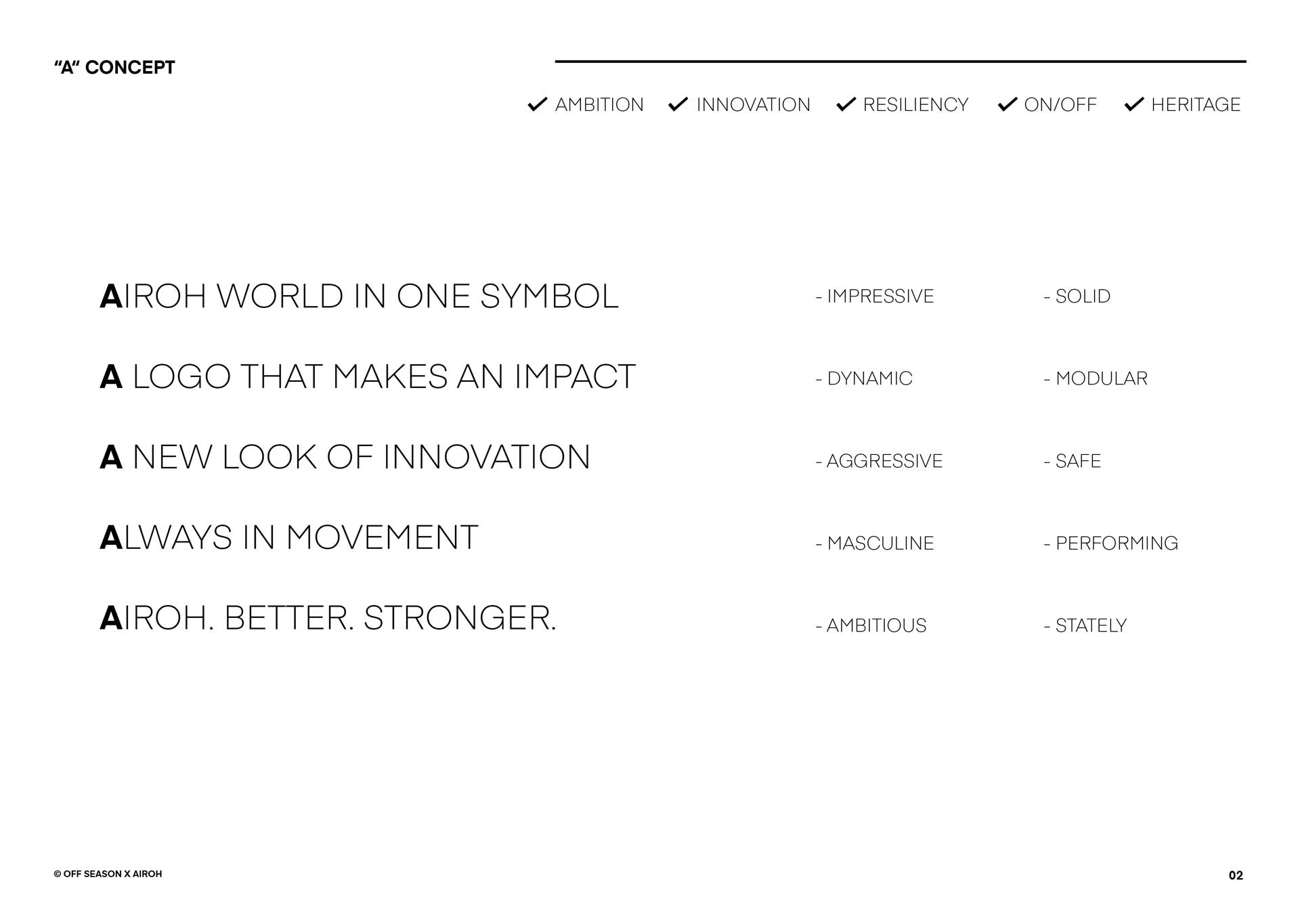
Modularity and impact.
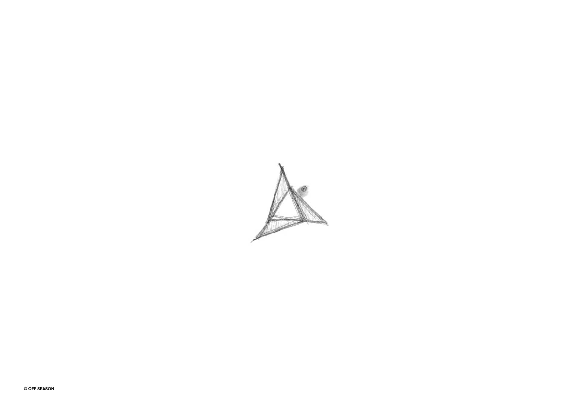
The idea for the logo comes from the same concept with which the products are designed:
Modularity and impact dissipation.
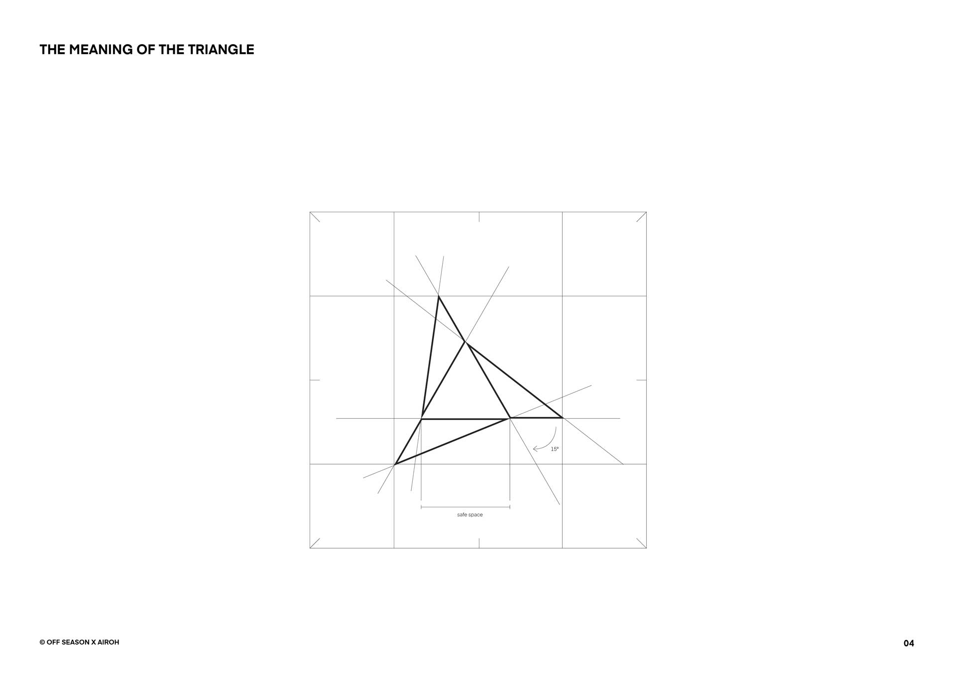
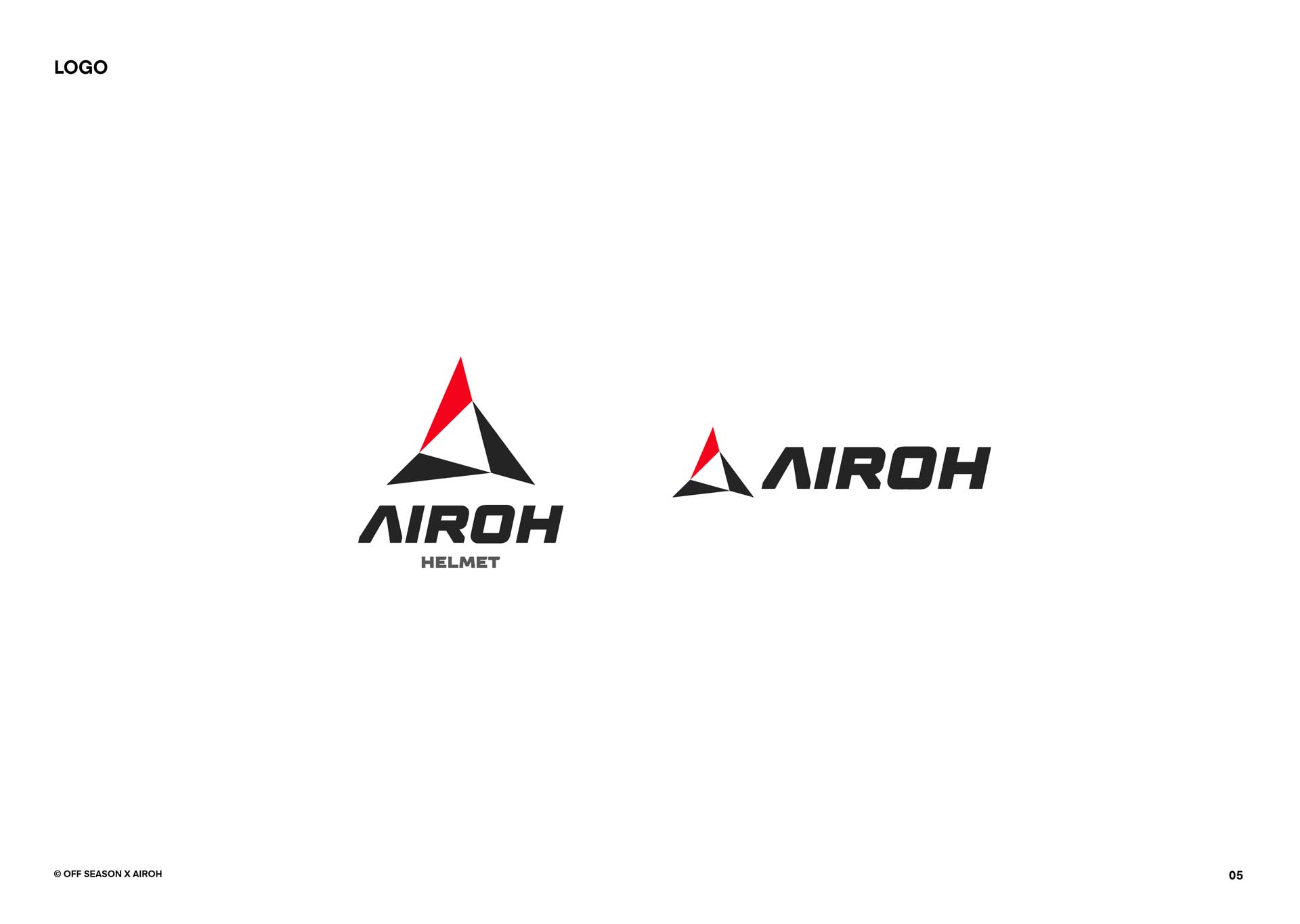
meaning of the triangle shape
Strength. The triangle is the strongest shape. Any weight placed on it is distributed evenly on all three sides. Historically it represents the four elements air, fire, earth and water and is the geometric shape that best expresses the concept of resilience.
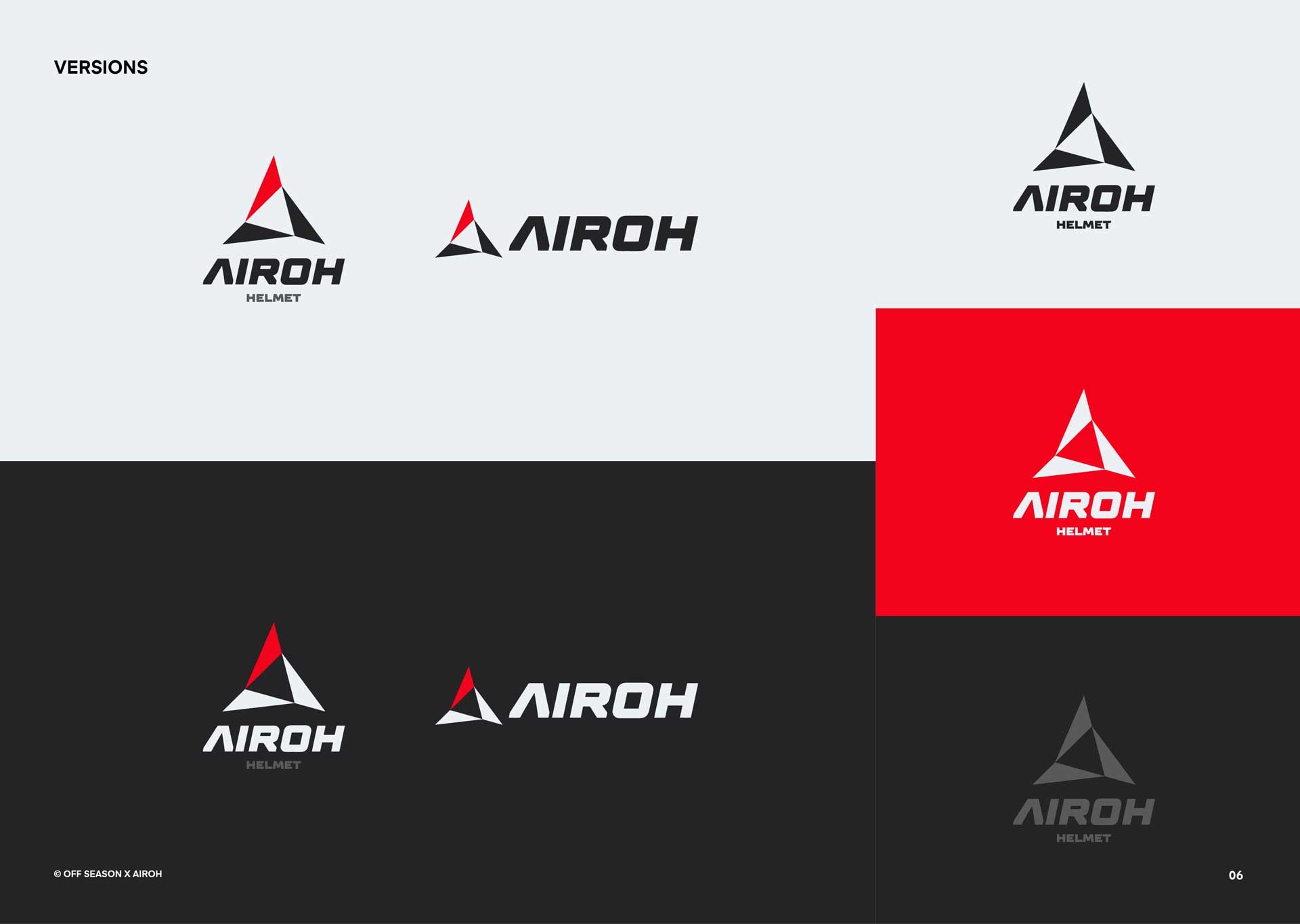
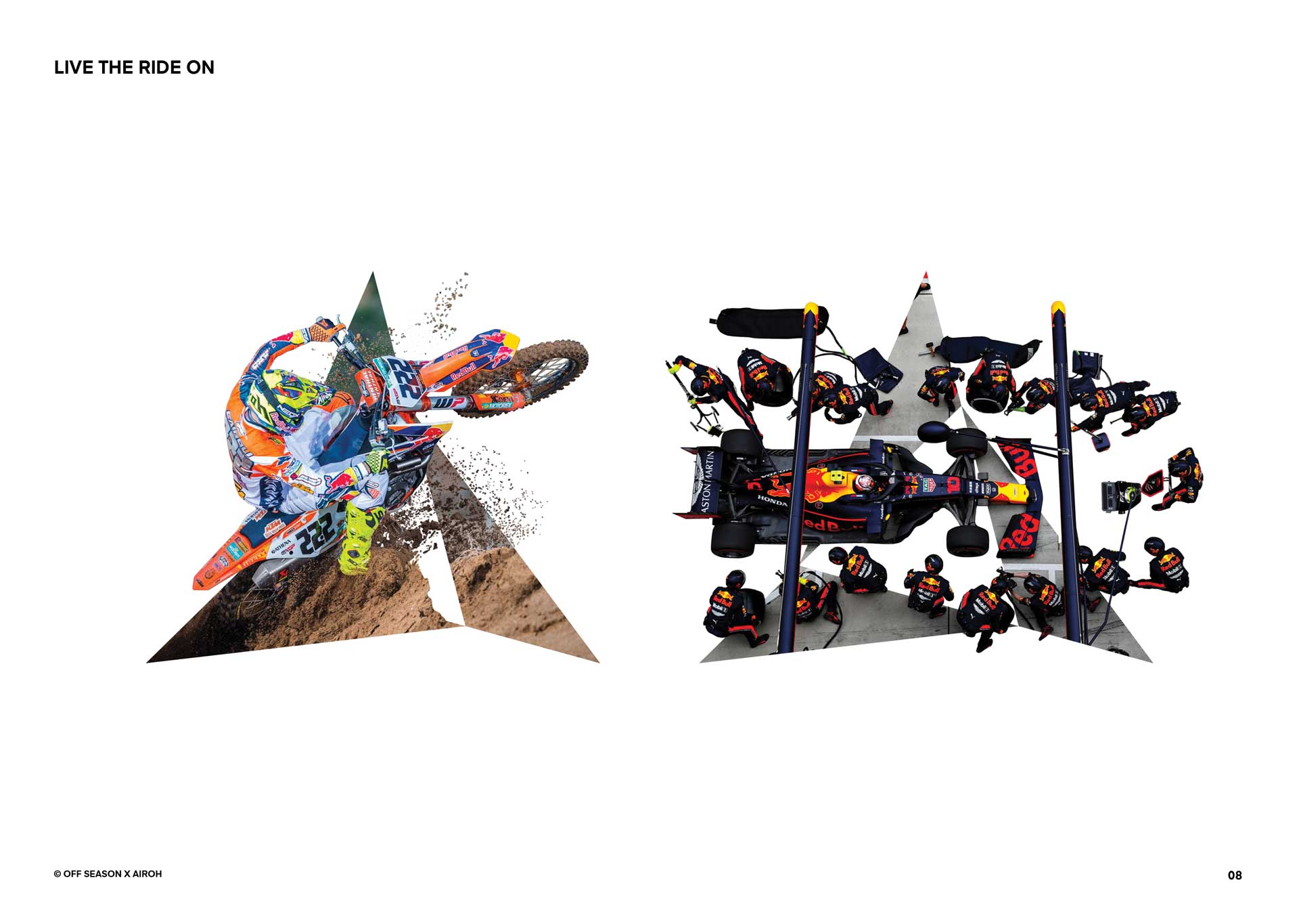
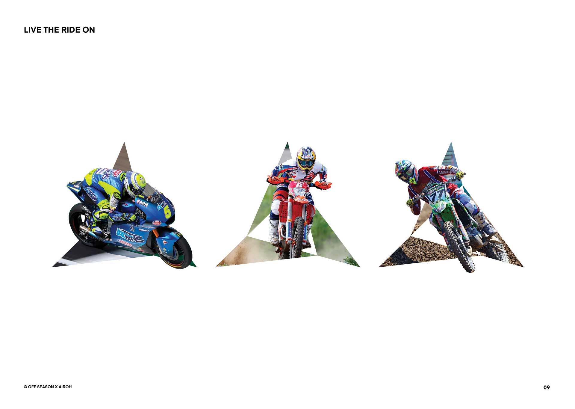
live the ride on
Not just a logo but an experience to live every day.
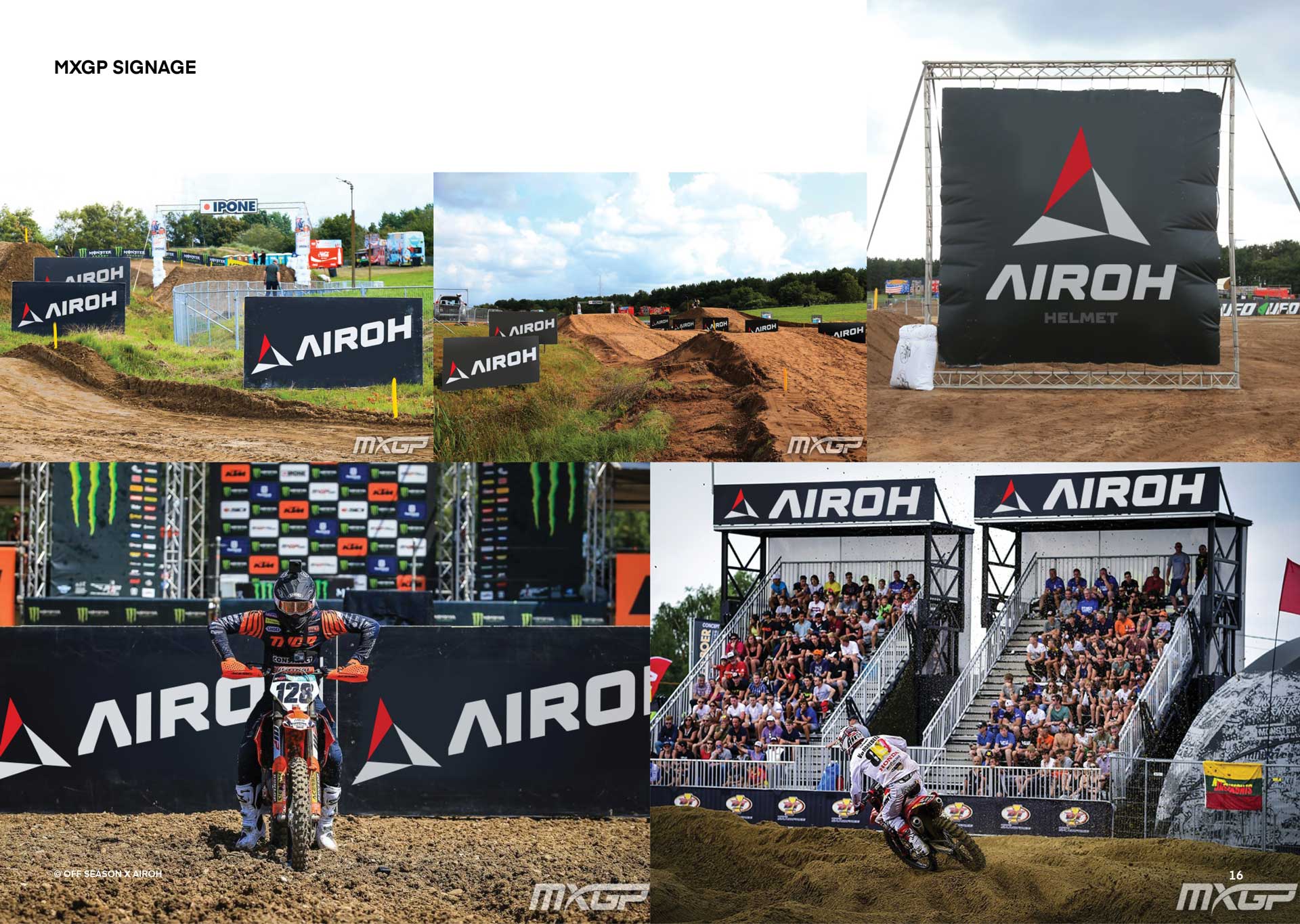
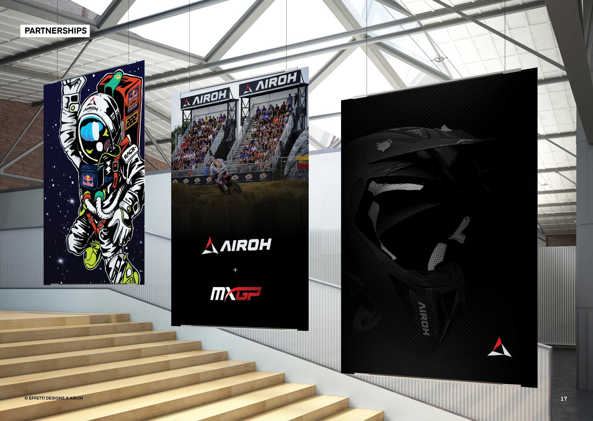
A dynamic communication system that connects directly the Brand and the Sports.