lbm sport
From running store to running culture.
project overview
LBM Sport has been one of Italy's leading running retailers for over 30 years. With a loyal community, technical expertise and deep roots in the sport.
LBM had already earned the trust of thousands of runners. The challenge was building a brand that reflected it. The existing identity positioned LBM as a retailer, while the business had evolved into something much bigger: a meeting point for runners, a specialist destination and a growing community. Our role was to transform that perception.
deliverables
- brand strategy & positioning
- creative direction
- verbal identity
- visual identity design
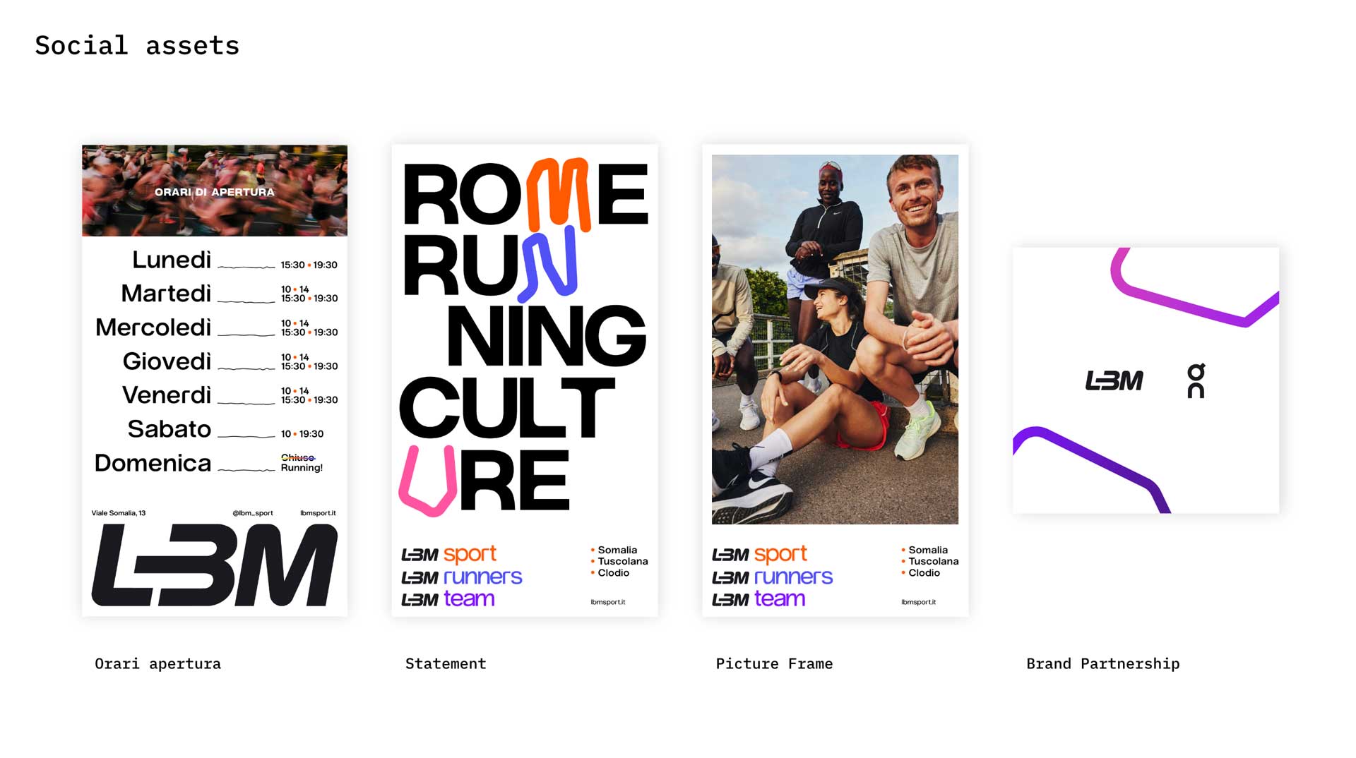
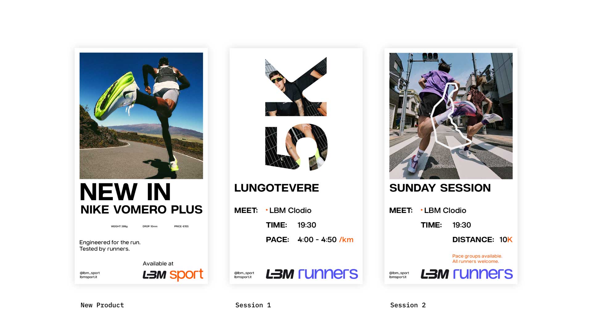
- social media assets
- motion system
- mockups & applications
challenge
Running has changed.
Today, people don't just buy products, ,they join communities. The opportunity wasn't to compete on price or assortment, but to create a brand people wanted to belong to.
One that could live equally well in retail, events, digital and community.
approach
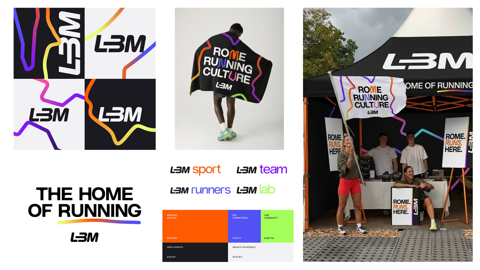
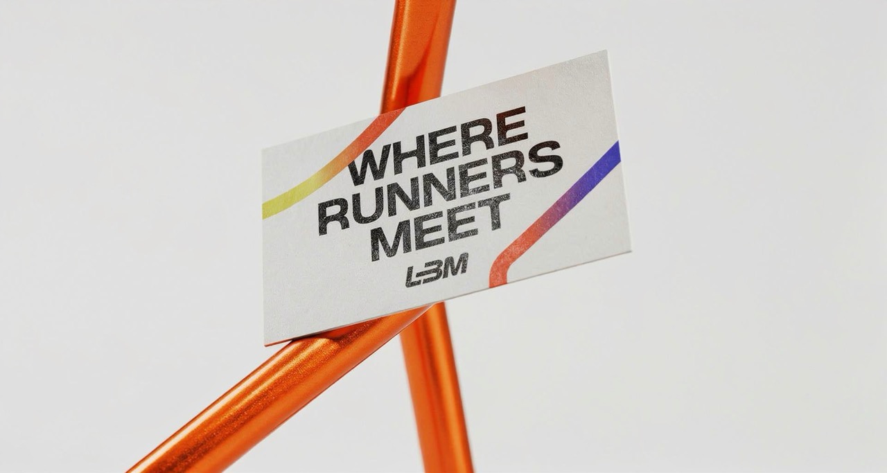
We repositioned LBM from a running store into a running culture brand.
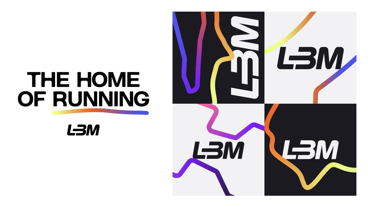
The strategic idea became: Where Runners Meet.
A positioning more than a tagline, A place where different runners, different goals and different journeys come together.
brand strategy & positioning.
The strategy process started by understanding where LBM already had an advantage.
People came to LBM because they trusted the team, joined the community and kept coming back.
The opportunity was to give the brand a clearer role: not simply a place to buy running gear, but a place where running culture could grow.
That thinking became the foundation for every decision that followed.
Different routines, different goals, different experiences, but they all need a place to meet.
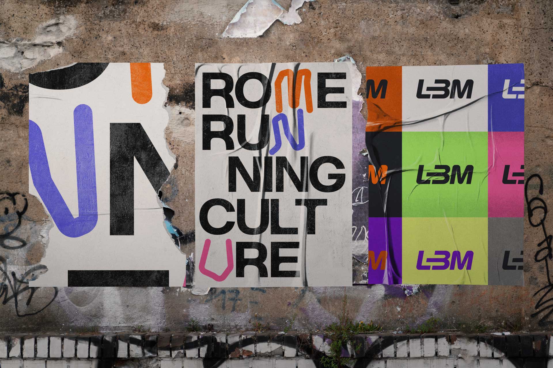
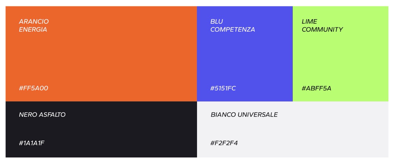
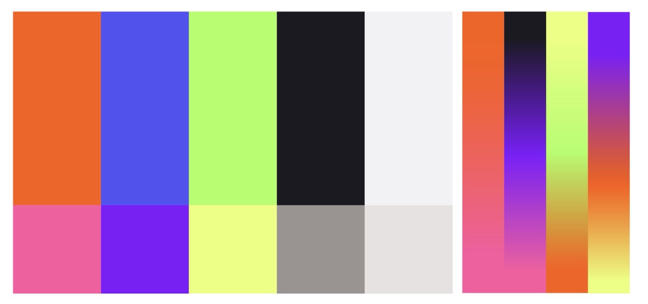
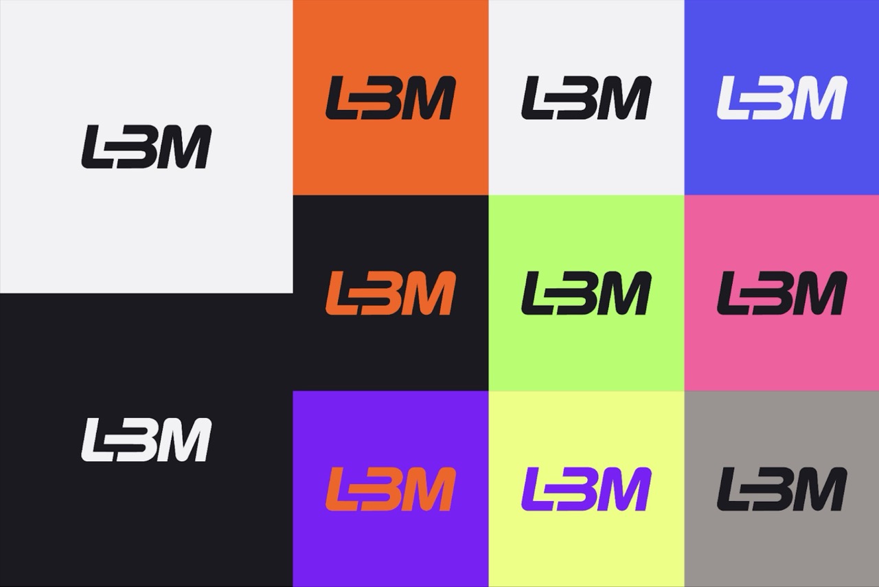
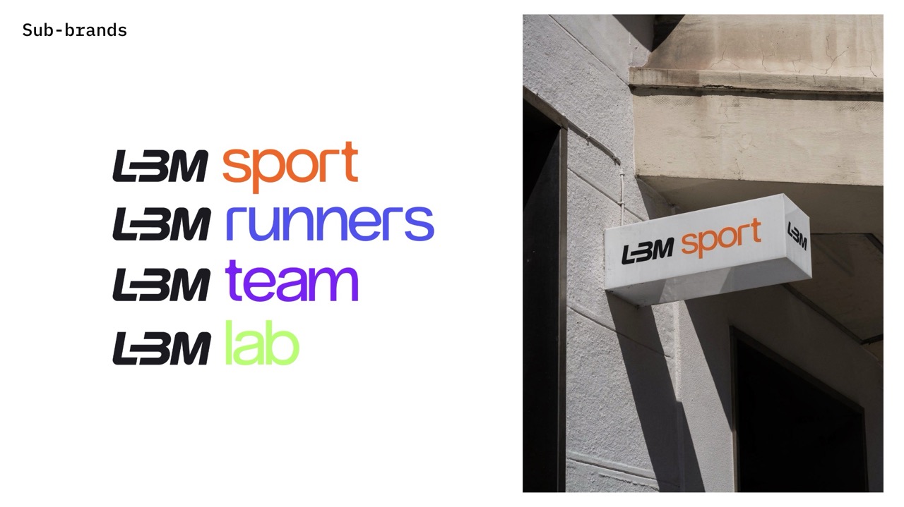
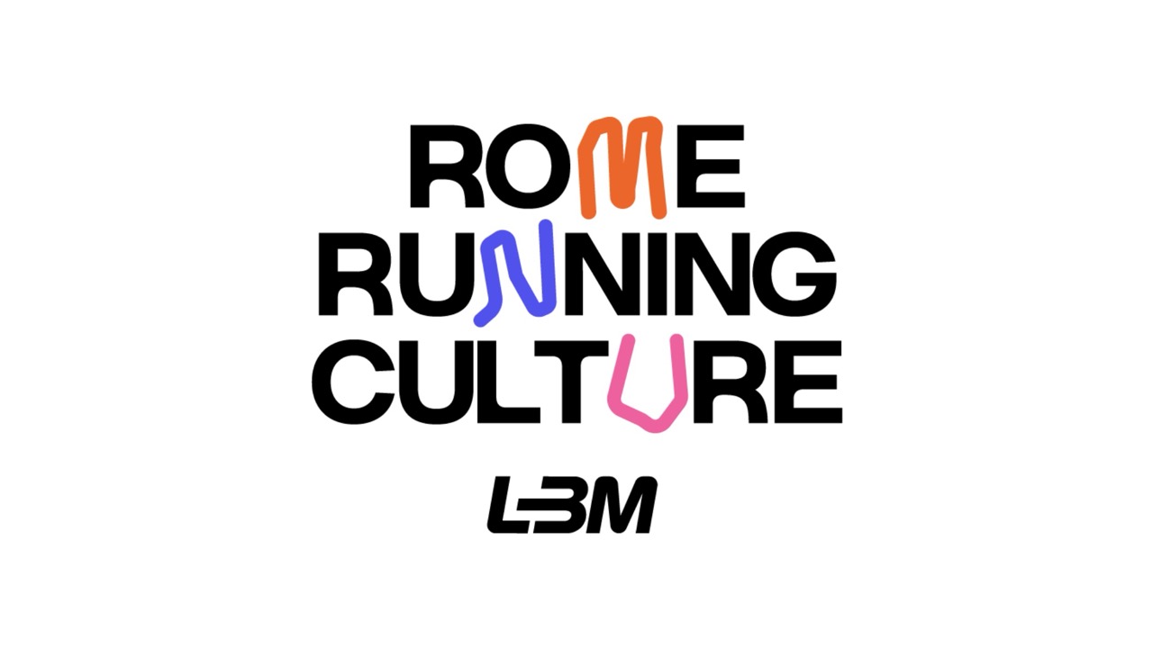
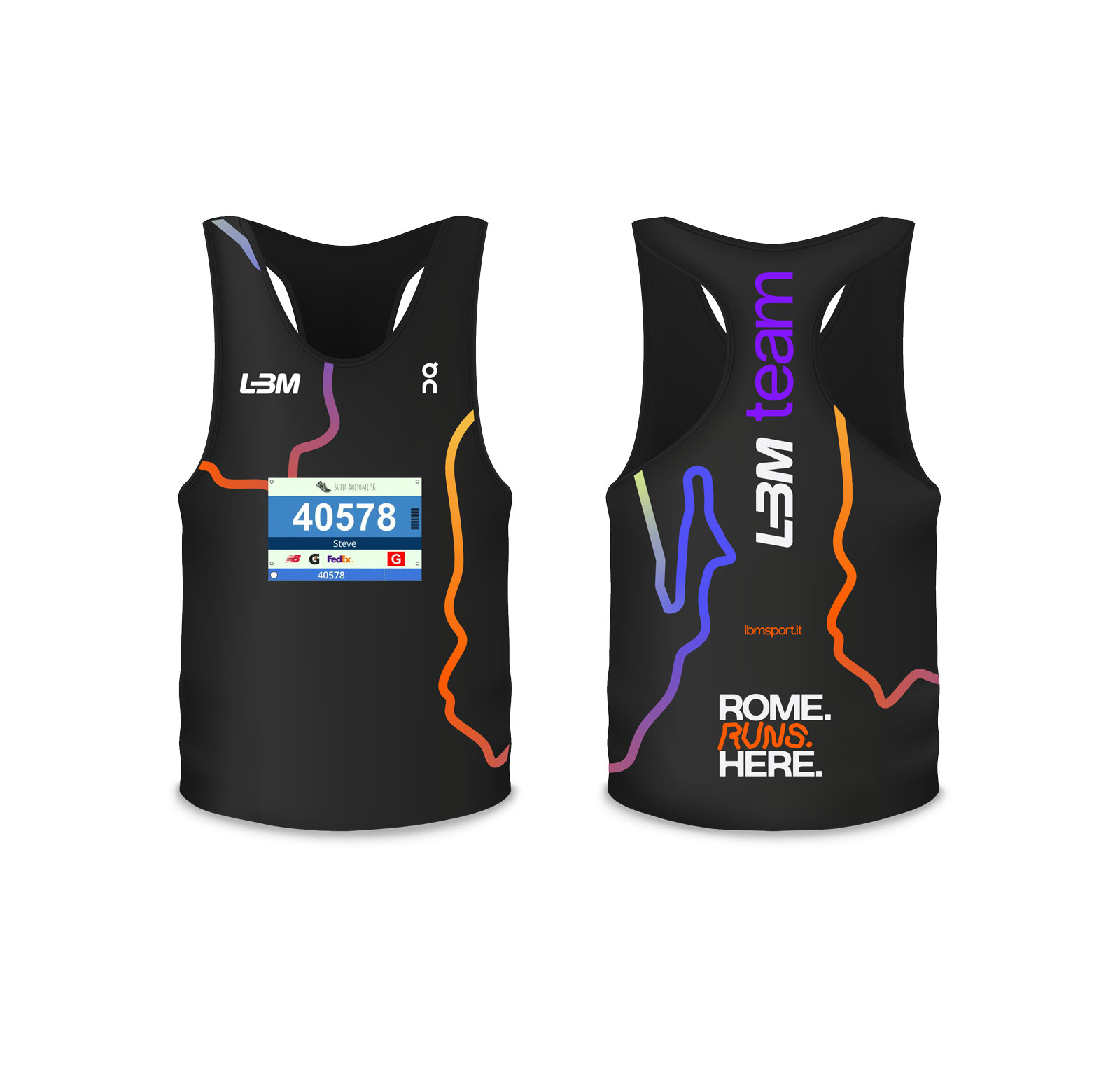
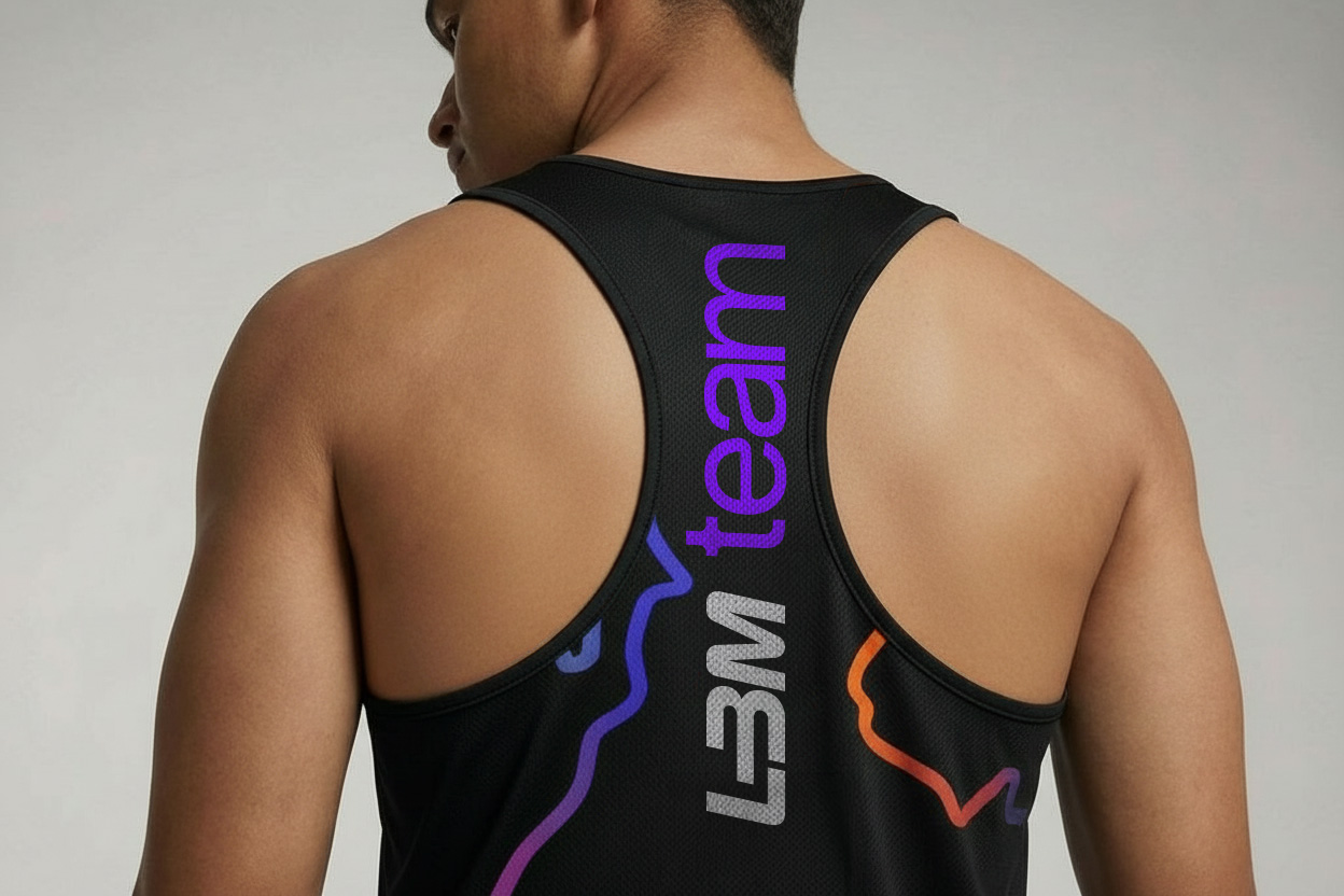
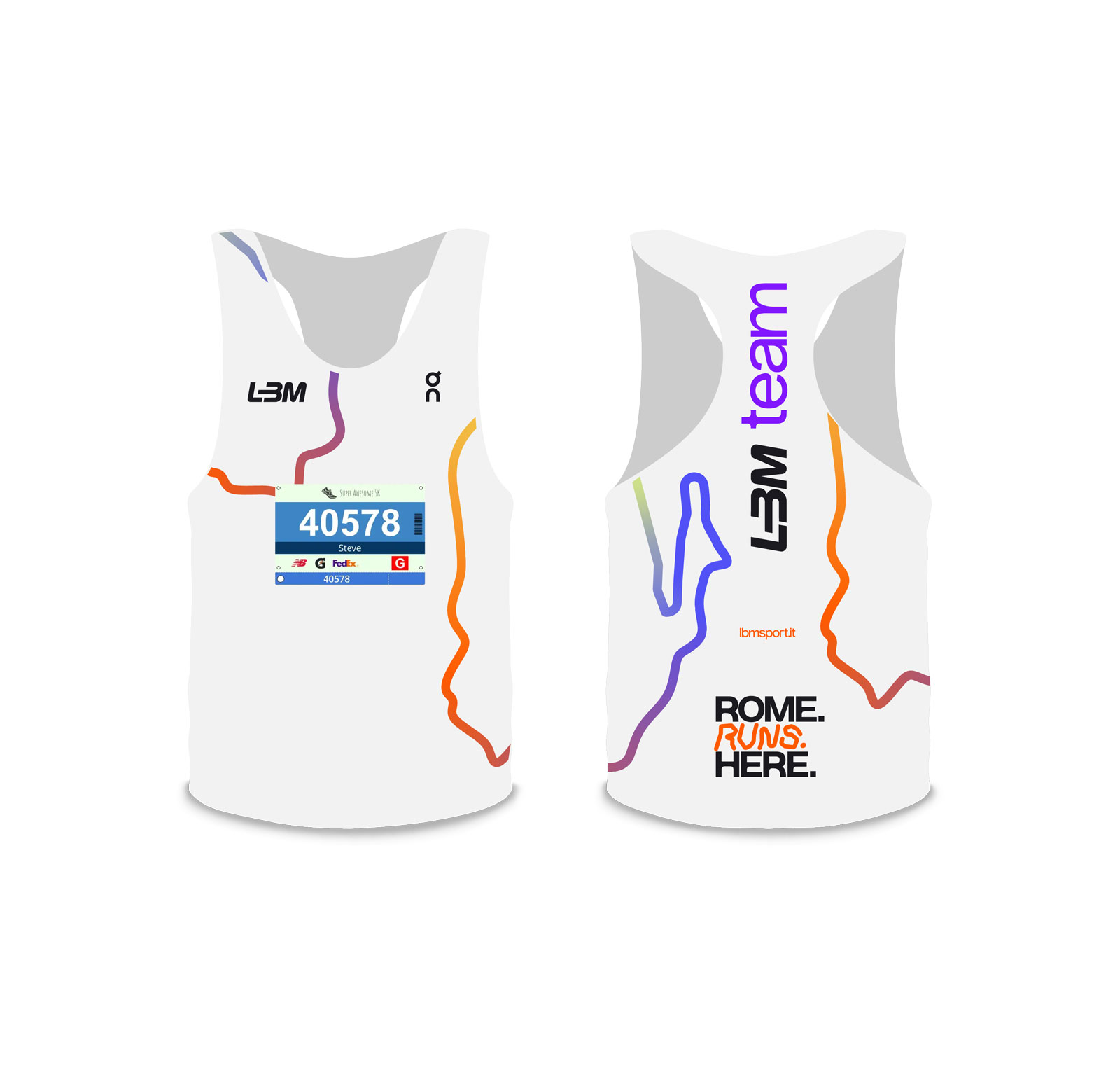
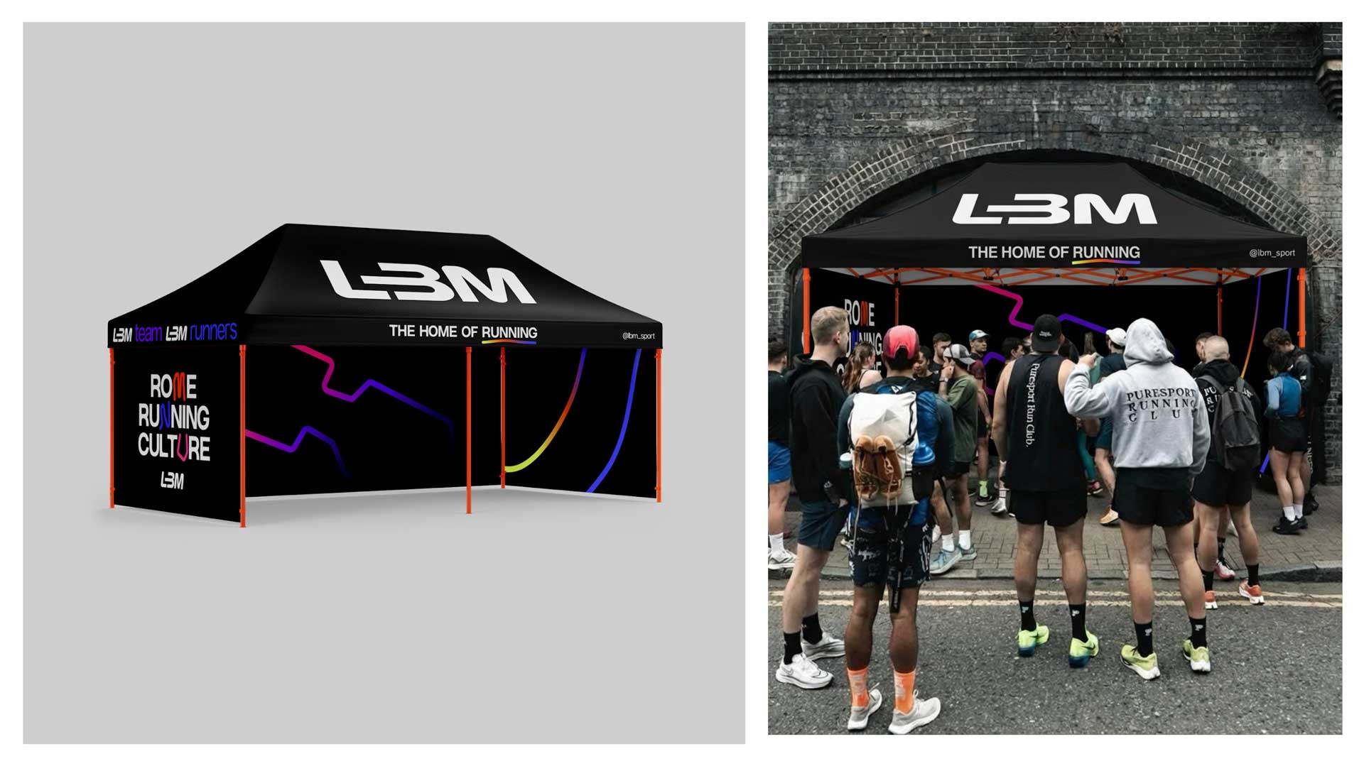
The identity is built as a flexible system rather than a fixed set of graphic elements. Paths intersect, shapes merge and colours overlap, reflecting the movement of different runners coming together.
Typography stays clear and functional, while the graphic language remains simple enough to work across retail, digital, apparel and motion.

across every touchpoint.
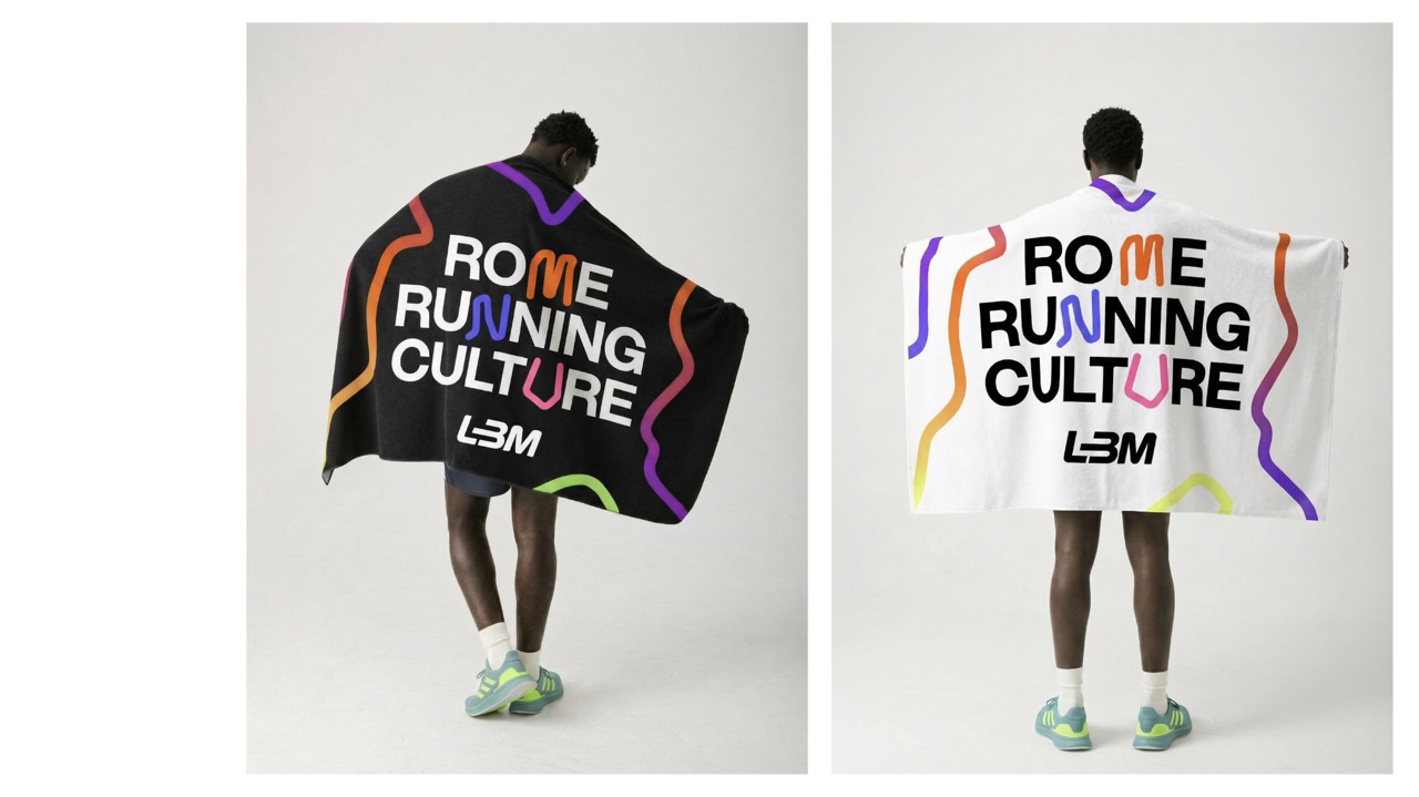
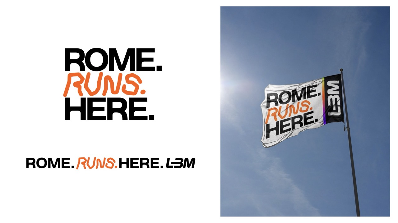
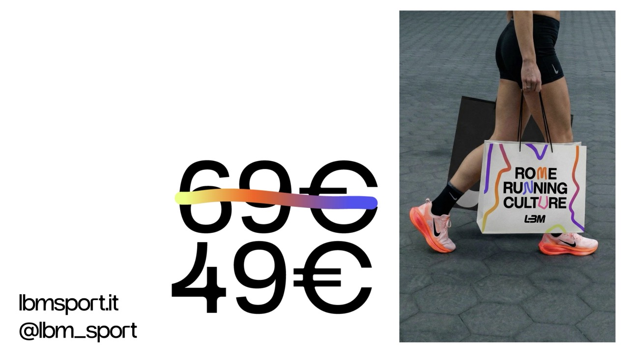
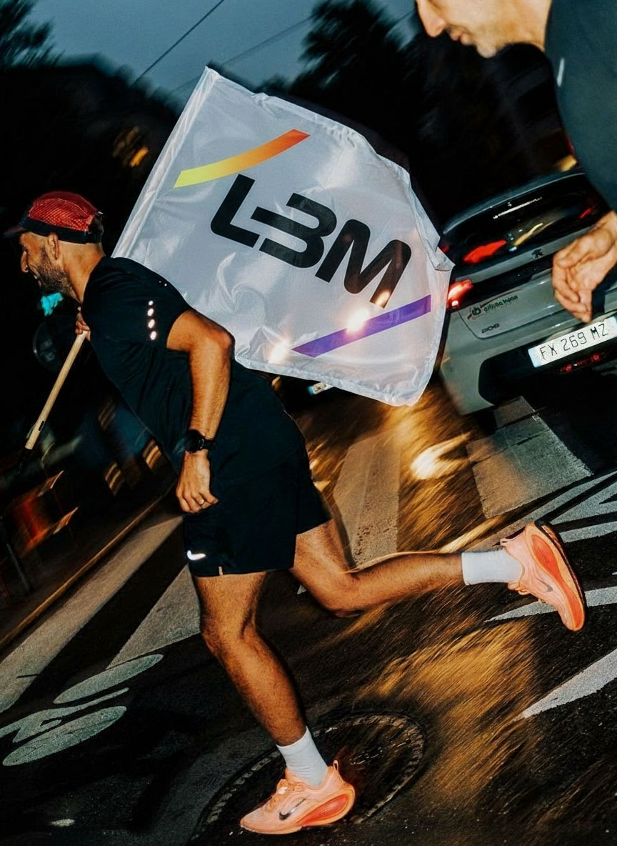
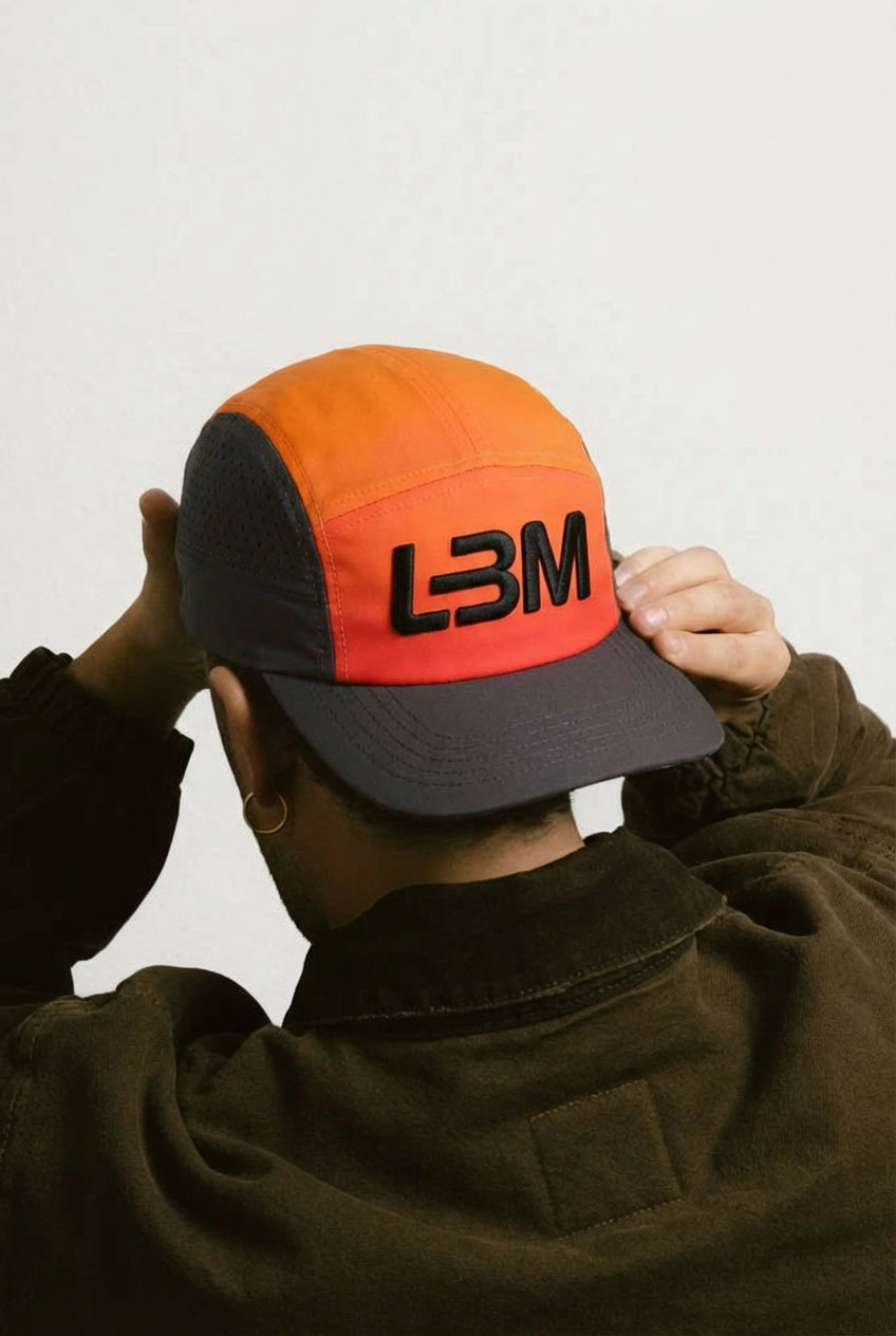
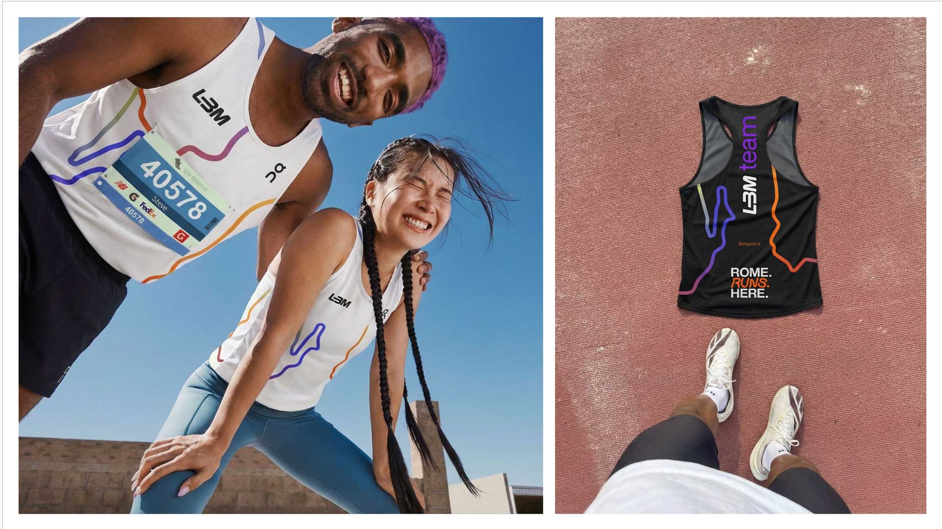
Once the system was defined, it was extended across every touchpoint. Store graphics, packaging, social templates, apparel, signage, motion, event communication and community assets were all designed using the same visual language.
Rather than treating each application as a separate exercise, the focus was on consistency. Every interaction with the brand whether online, in-store or at a group run should feel like part of the same experience.


designed to move.
The project gave LBM a brand that better reflects what it has become over the years.
A specialist running retailer, a local community and a place where people return not only for products, but for the experience of running together.
The new identity creates a foundation that can evolve across future stores, digital platforms and community initiatives while staying true to the same idea that shaped it from the beginning.