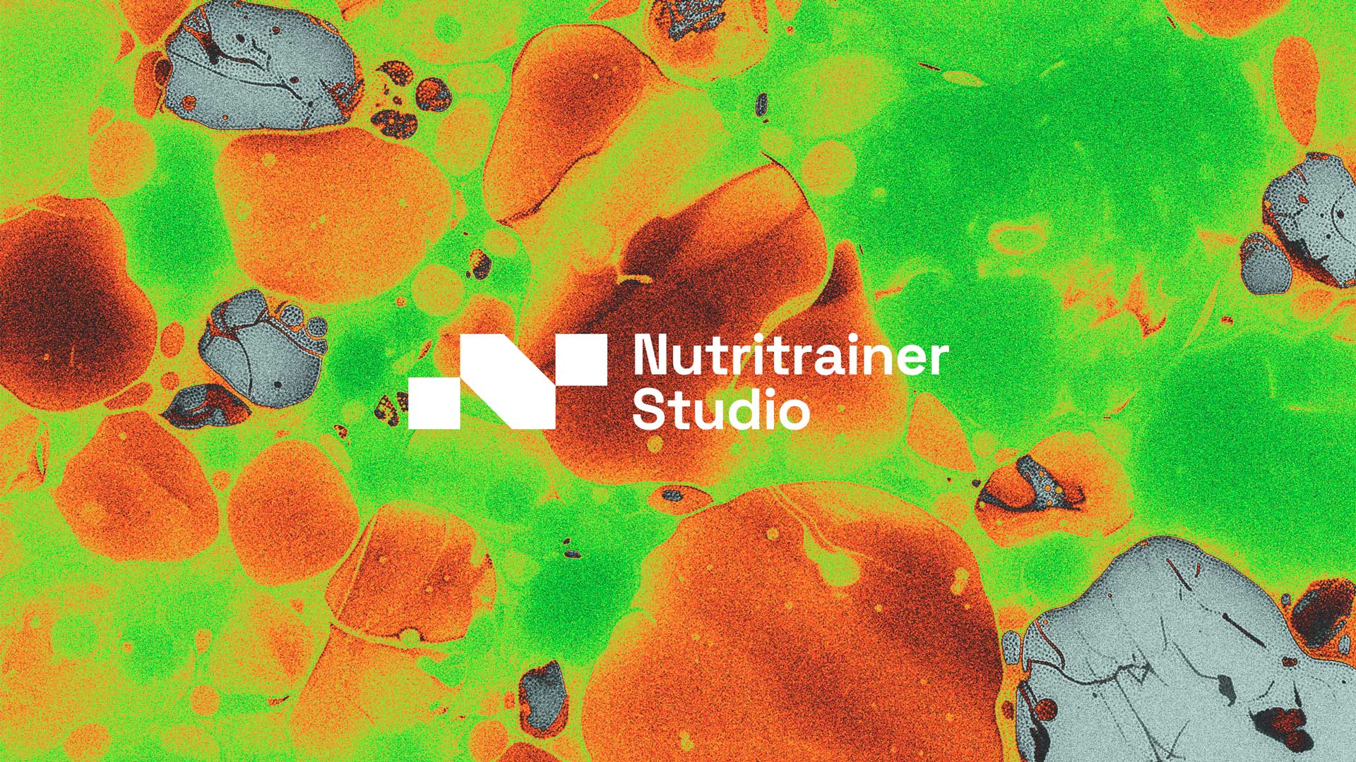
nutritrainer
science supporting performance
project overview
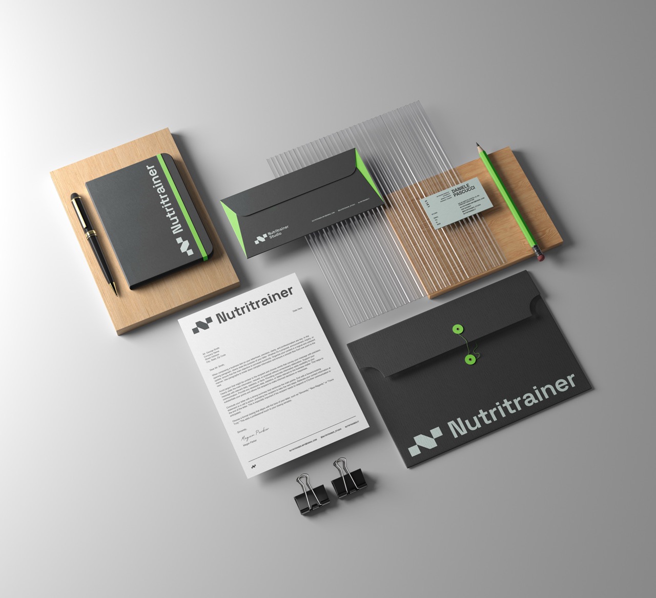
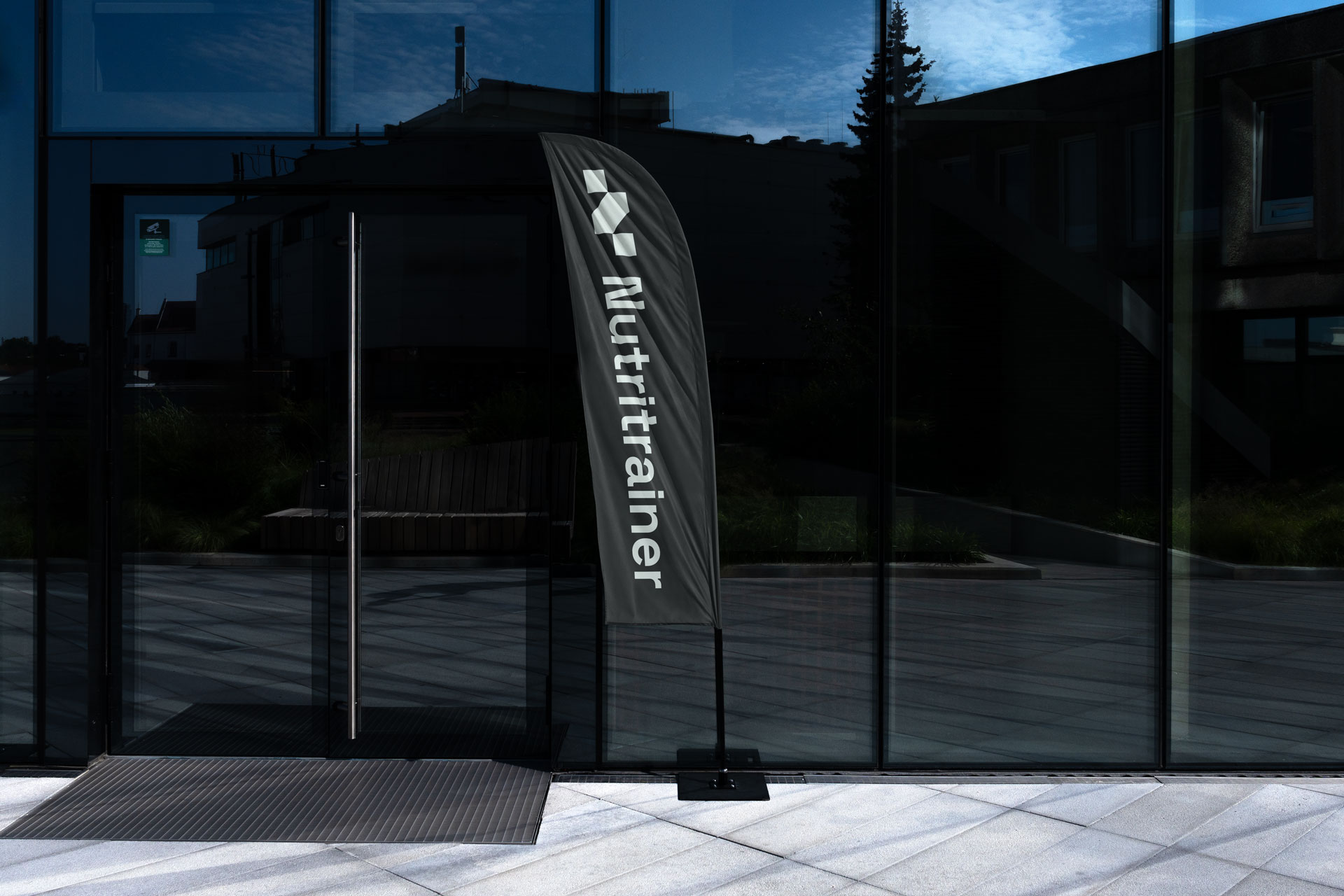
We shaped a dynamic brand identity for Nutritrainer Studio, blending performance with modern digital aesthetics. Through creative direction, visual design and content, we built a fresh, high-energy language that elevates the studio’s mission within the cycling and endurance world.
deliverables
- creative direction
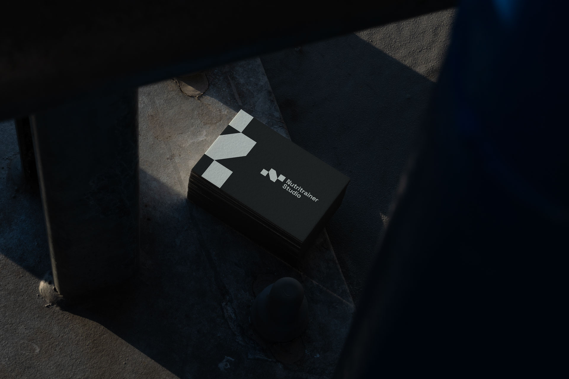
- brand identity
- visual assets
- motion design
- content production

challenge
Nutritrainer is a nutrition studio deeply rooted in the cycling sport, needed a bold and dynamic brand identity to stand out in a saturated space.
The goal was to speak directly to both amateur and professional athletes, conveying scientific credibility while remaining human, accessible, and performance-driven.
The challenge was to create a brand ecosystem that could expand while staying visually coherent and emotionally engaging.
approach
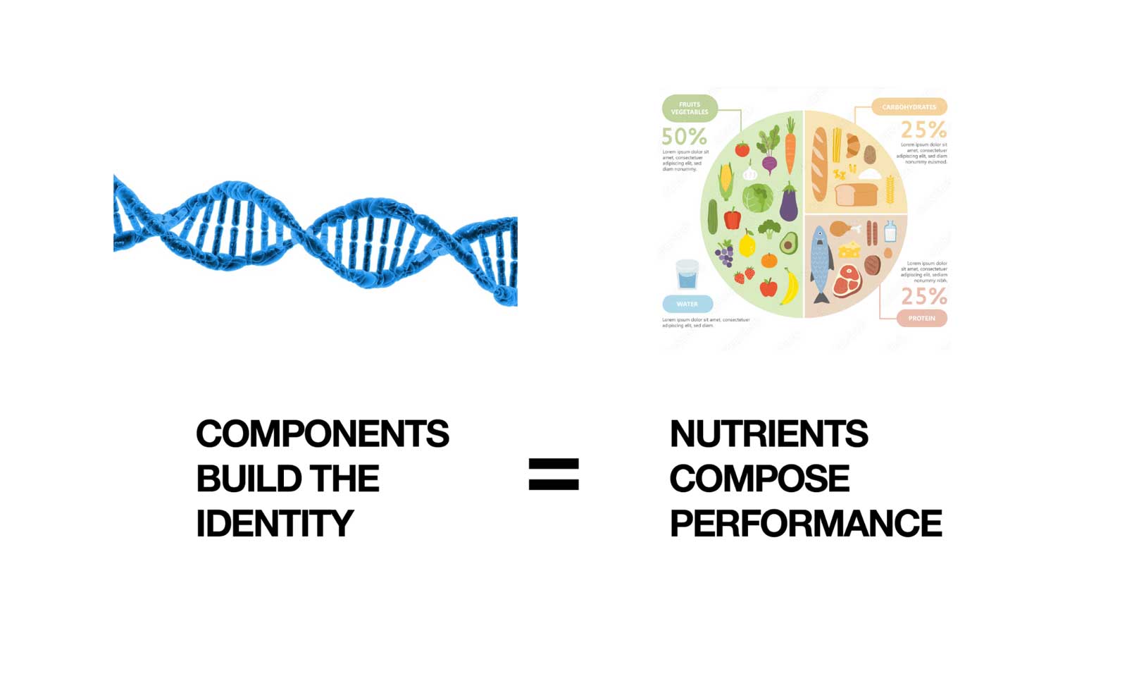
We built the brand identity around a core concept:
Components that create identity, just as nutrients build performance.
This idea became the foundation for a modular visual system where every shape, form, and graphic element is treated like a “nutrient”: essential, purposeful, and part of a greater whole.
The design language mirrors the nutritional philosophy of balance and precision.
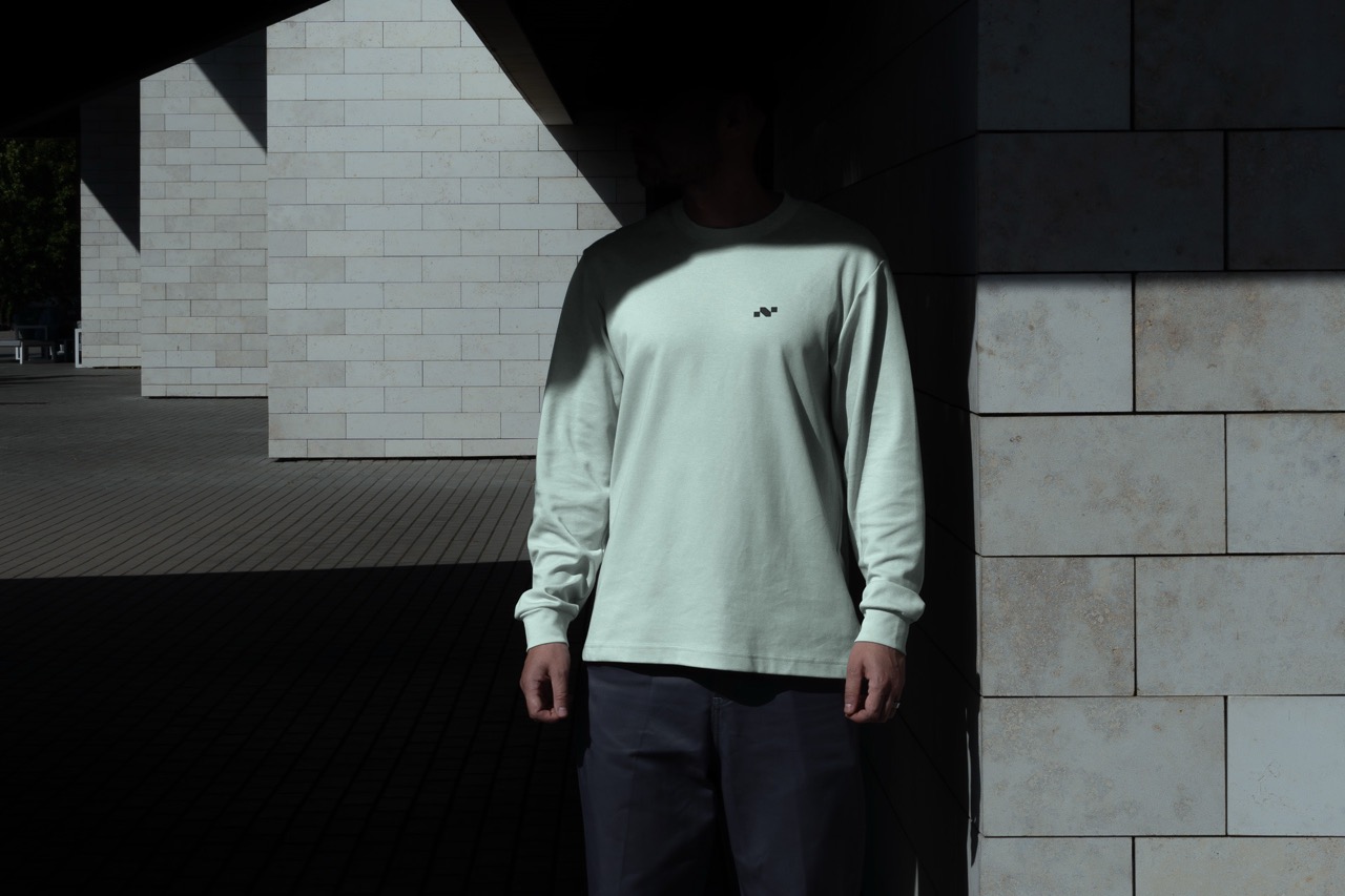
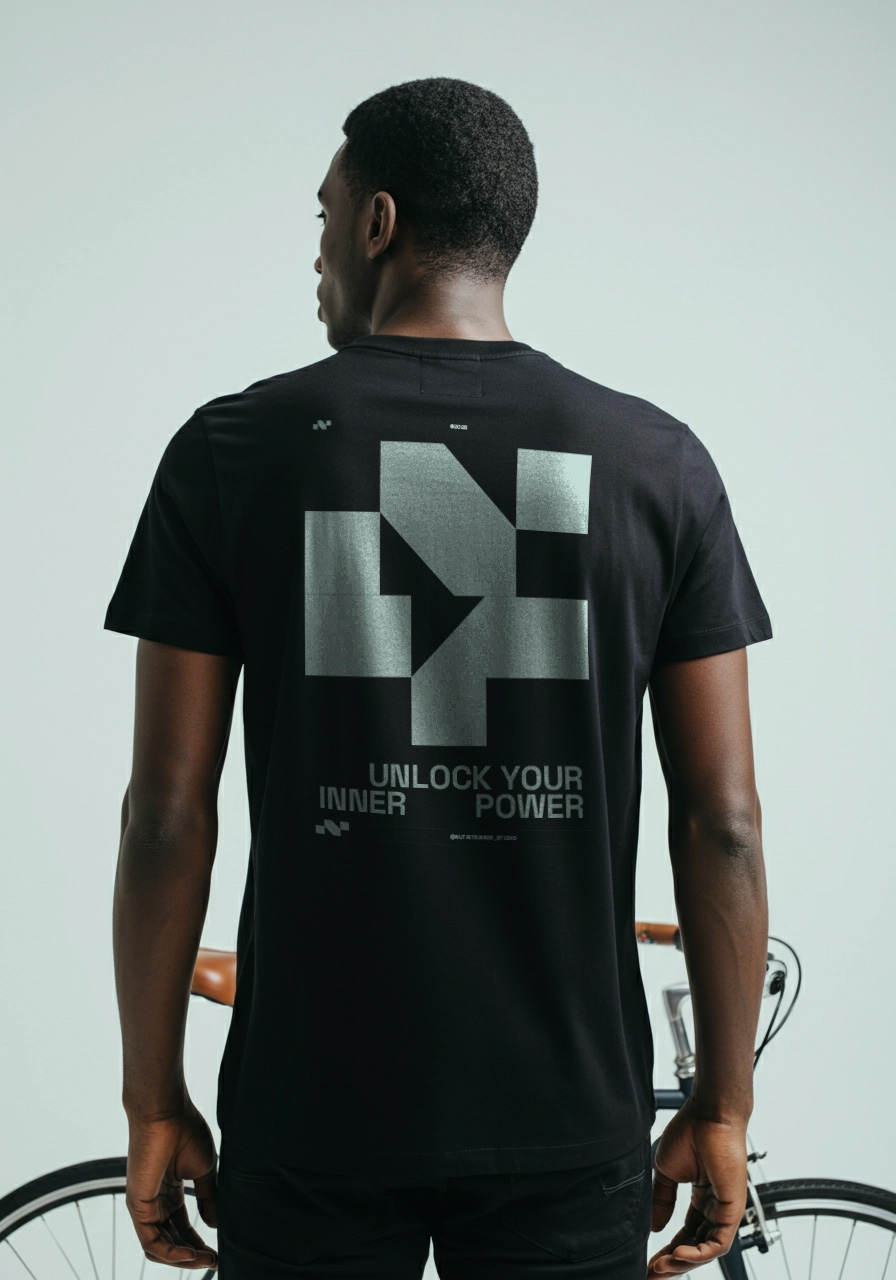
nutritrainer cycling
The cycling-focused sub-brand was developed as a natural extension, sharing the same DNA while visually targeting the cycling community with energy and specificity.
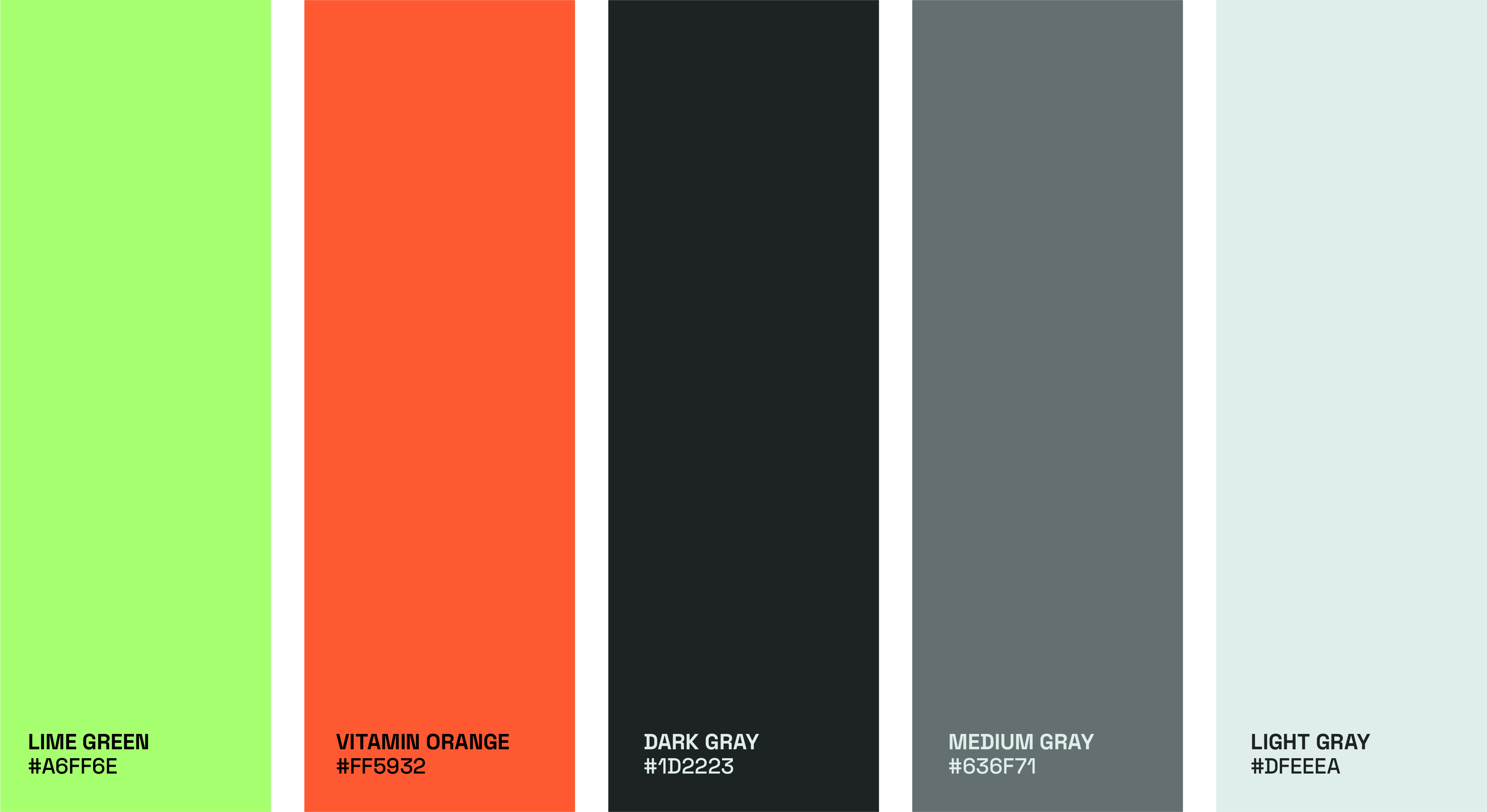
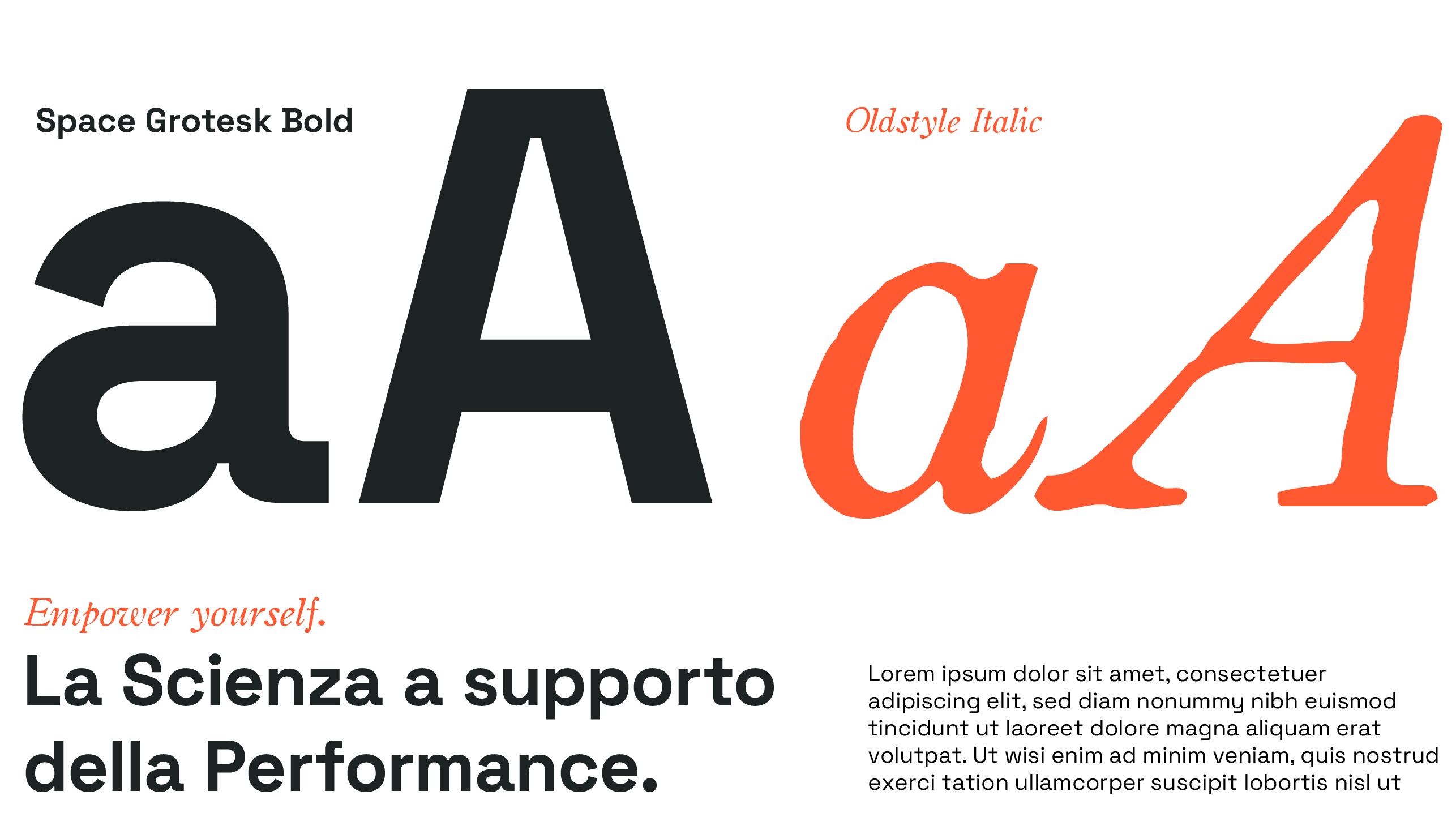
Our approach combined clean typography, high-contrast color palettes, and flexible graphic components that could adapt seamlessly across digital, print, and social content.
the visual diet of the brand
The identity of a brand as a living organism, in which each component has its function and its value.
When these elements are combined in a modular and strategic way, the result is a coordinated, coherent and dynamic image, capable of transmitting values, emotions and professionalism.
Thus each single graphic element becomes an integral part of the visual diet of the brand.
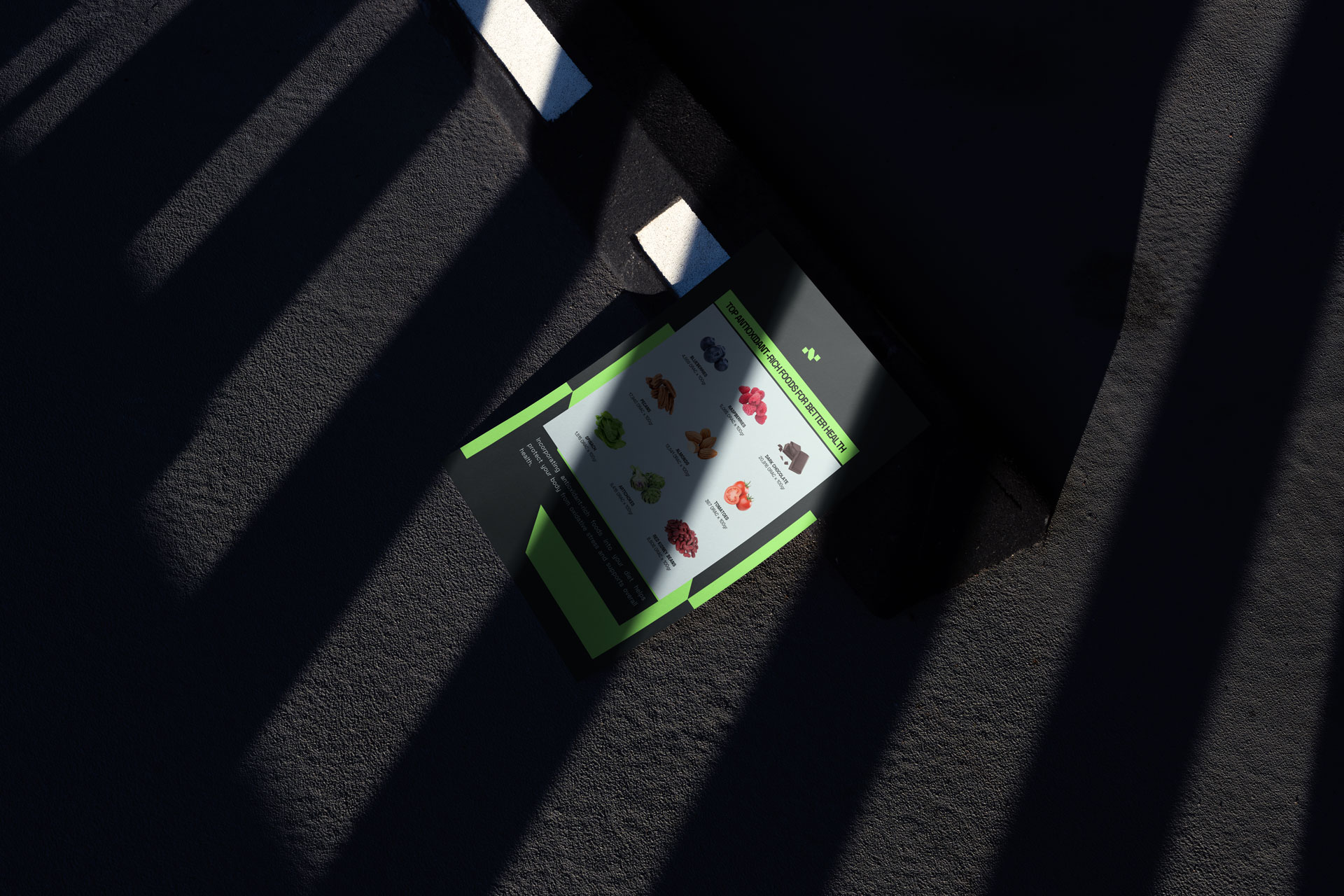
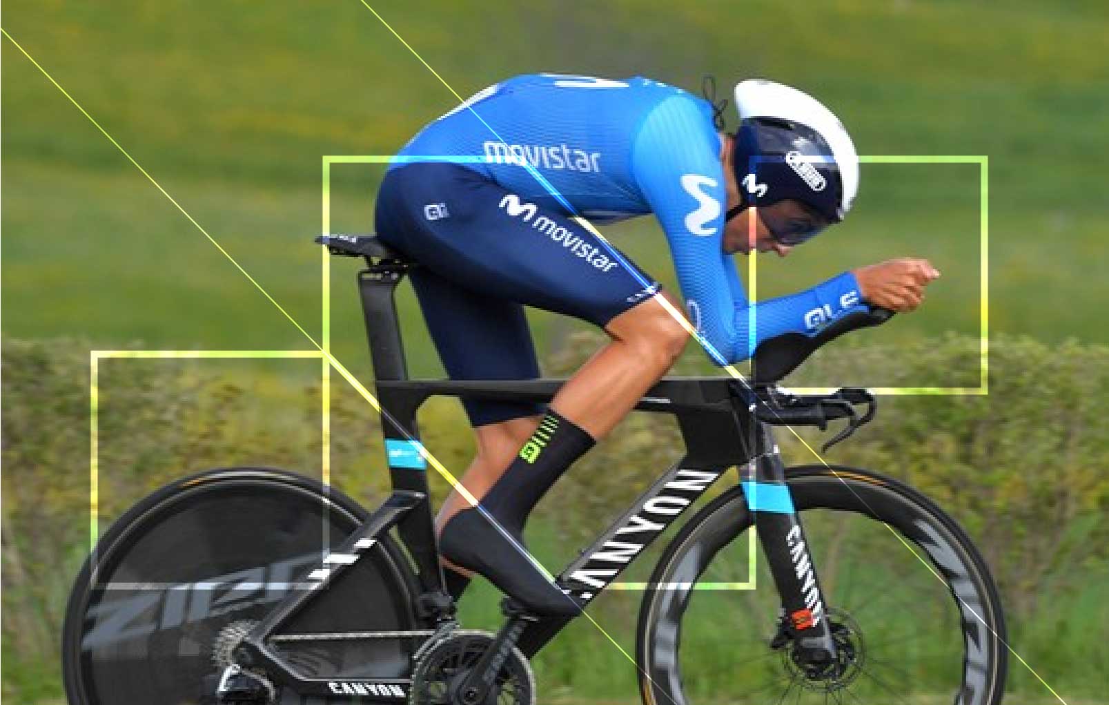
social informative content strategy
the social media strategy leverages the modular design system to create dynamic, engaging content that resonates with our audience.
By translating the core visual elements of NutriTrainer into adaptable formats, we ensure a consistent yet versatile presence across platforms.
The result is a digital identity that is not only eye-catching but also communicates the brand's commitment to performance and nutrition, inviting users to interact and engage with inspiring, informative content.