raul fernandez

opposite energies
create balance
team:
creative director: fabio troyli
project manager: marco troyli
client: raul fernandez
account: david gomez, jordi arilla
content creators: patrick tigtig, angel altes
project overview
For MotoGP rider Raúl Fernández, we created a sharp, attitude-driven visual identity that captures his speed and character. Through creative direction, branding and content, we crafted a system that brings his racing persona to life on and off the track.
deliverables
- creative direction
- brand identity
- motion design
- merchandising design
- digital & ecommerce
brand design
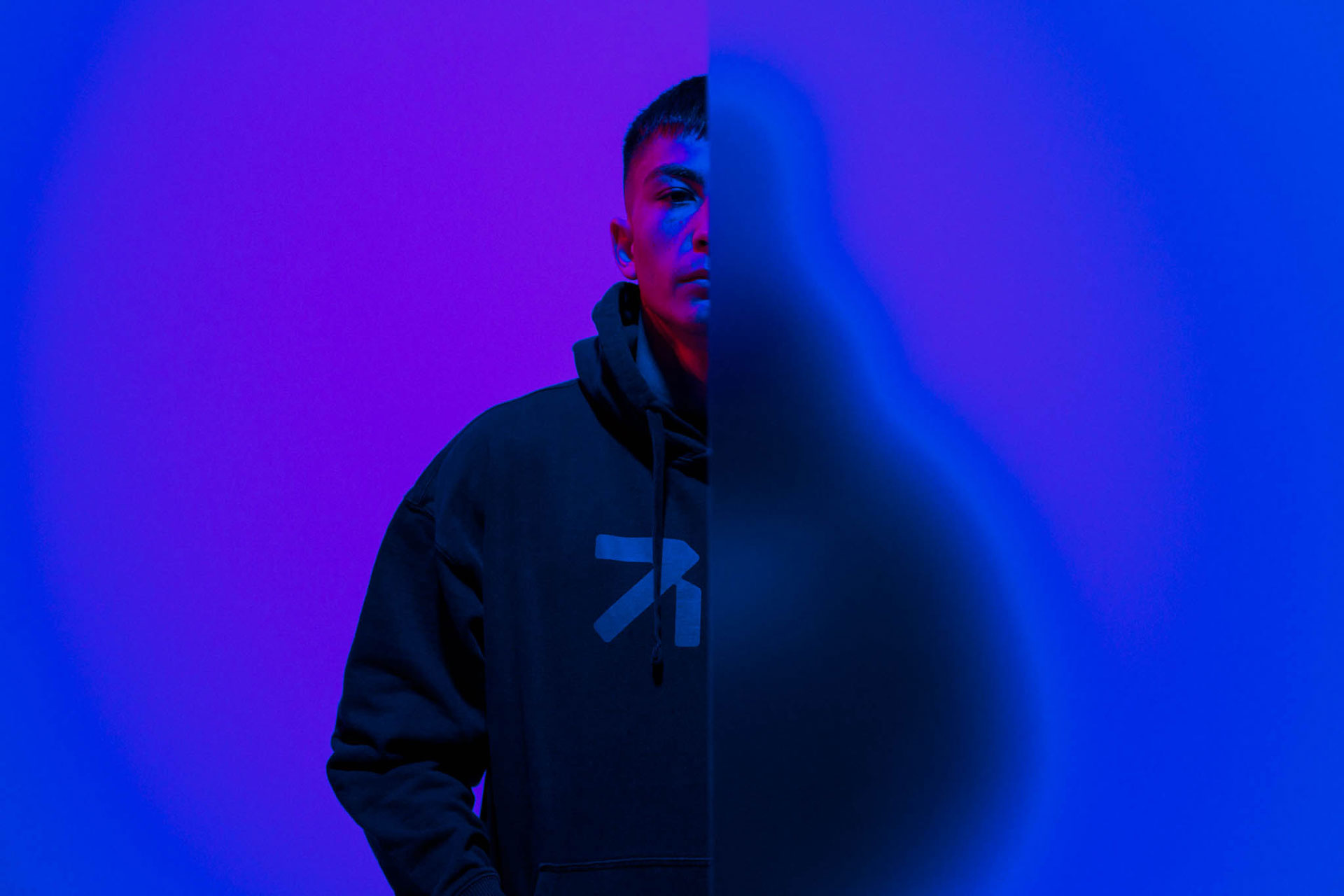
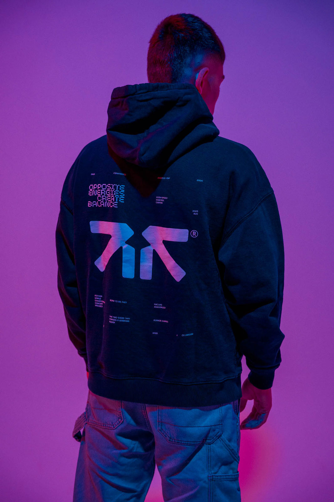
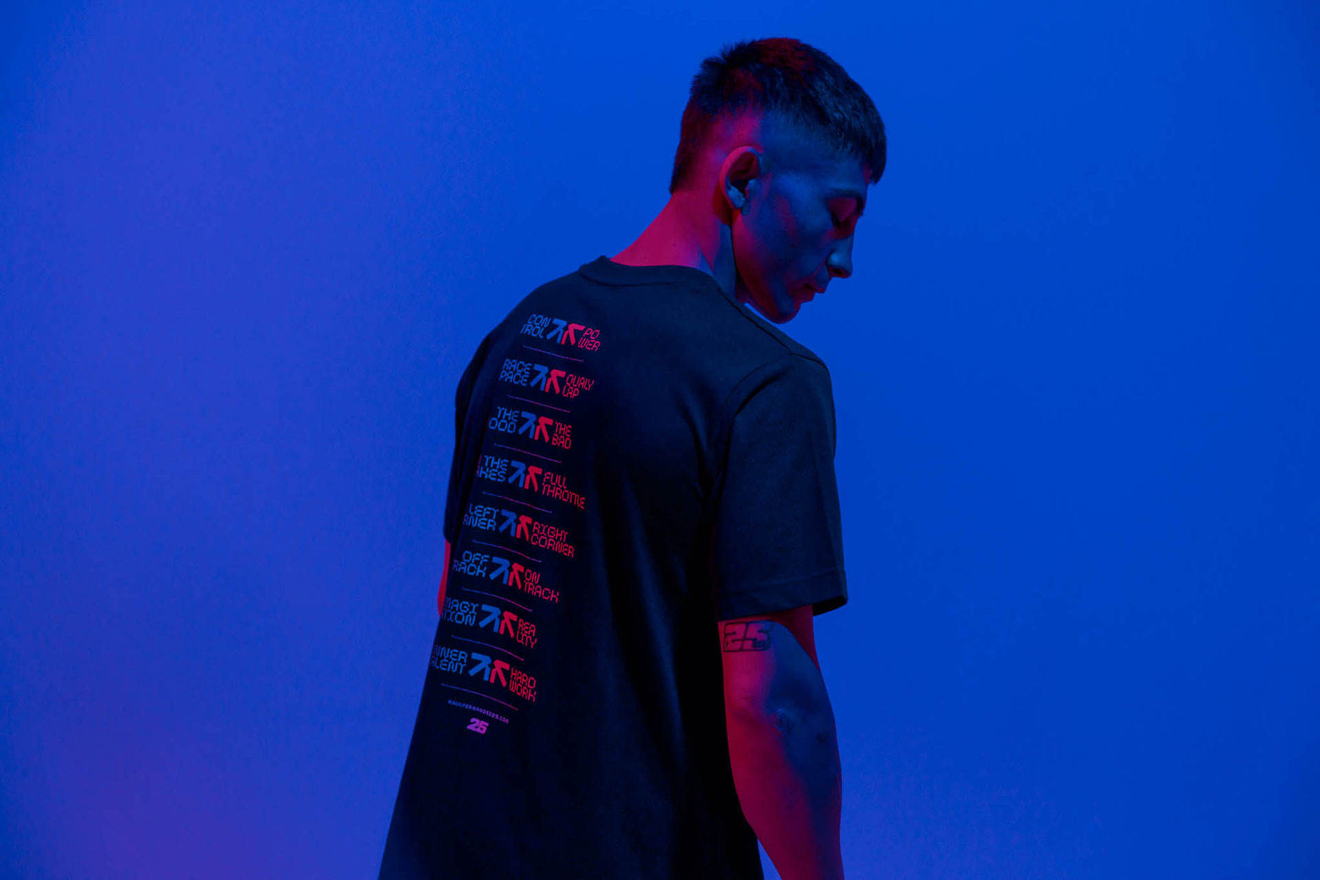
The collaboration between us began with a deep dive into Raul Fernandez’s persona. We sought to capture the unique balance between the sides that identify him.
With the guiding concept "Opposite energies create balance" we crafted a brand identity that is both bold and classy a true reflection of his dynamic character on and off the track.

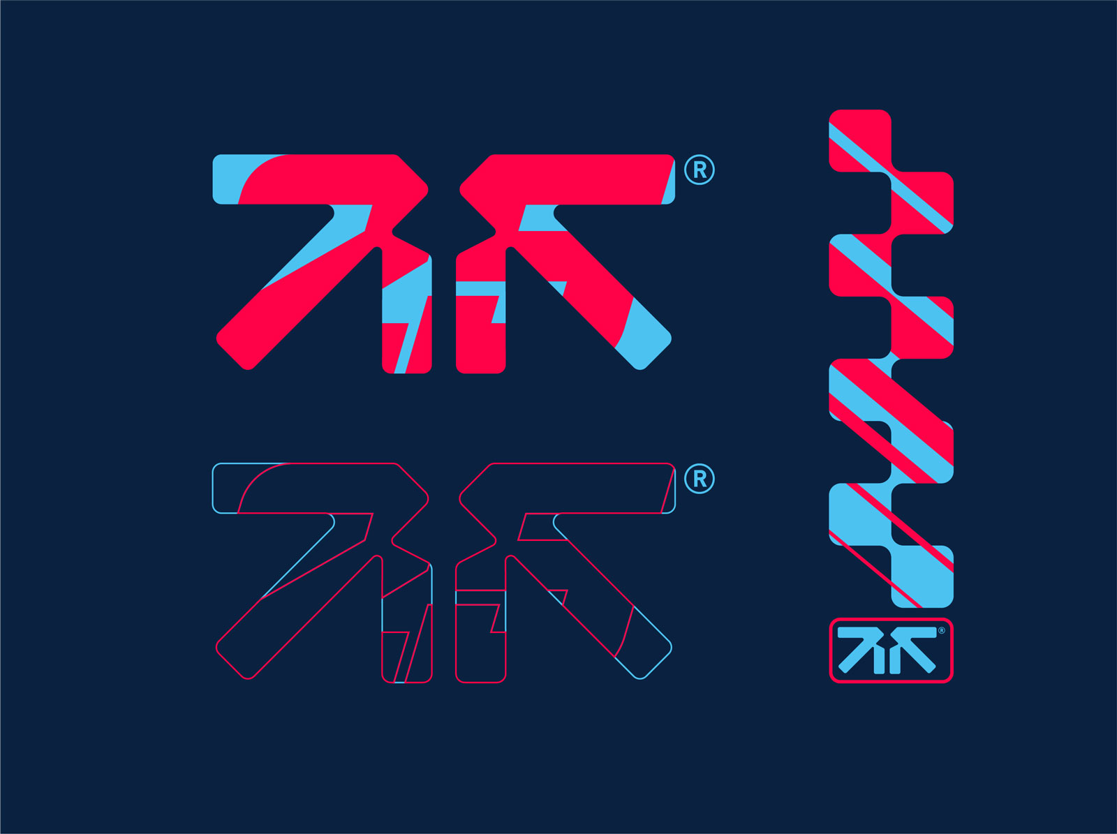
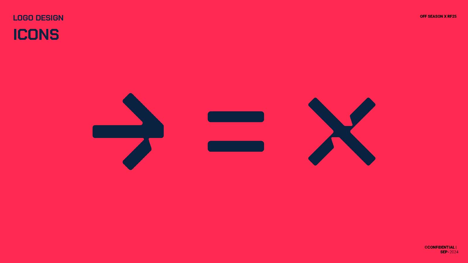

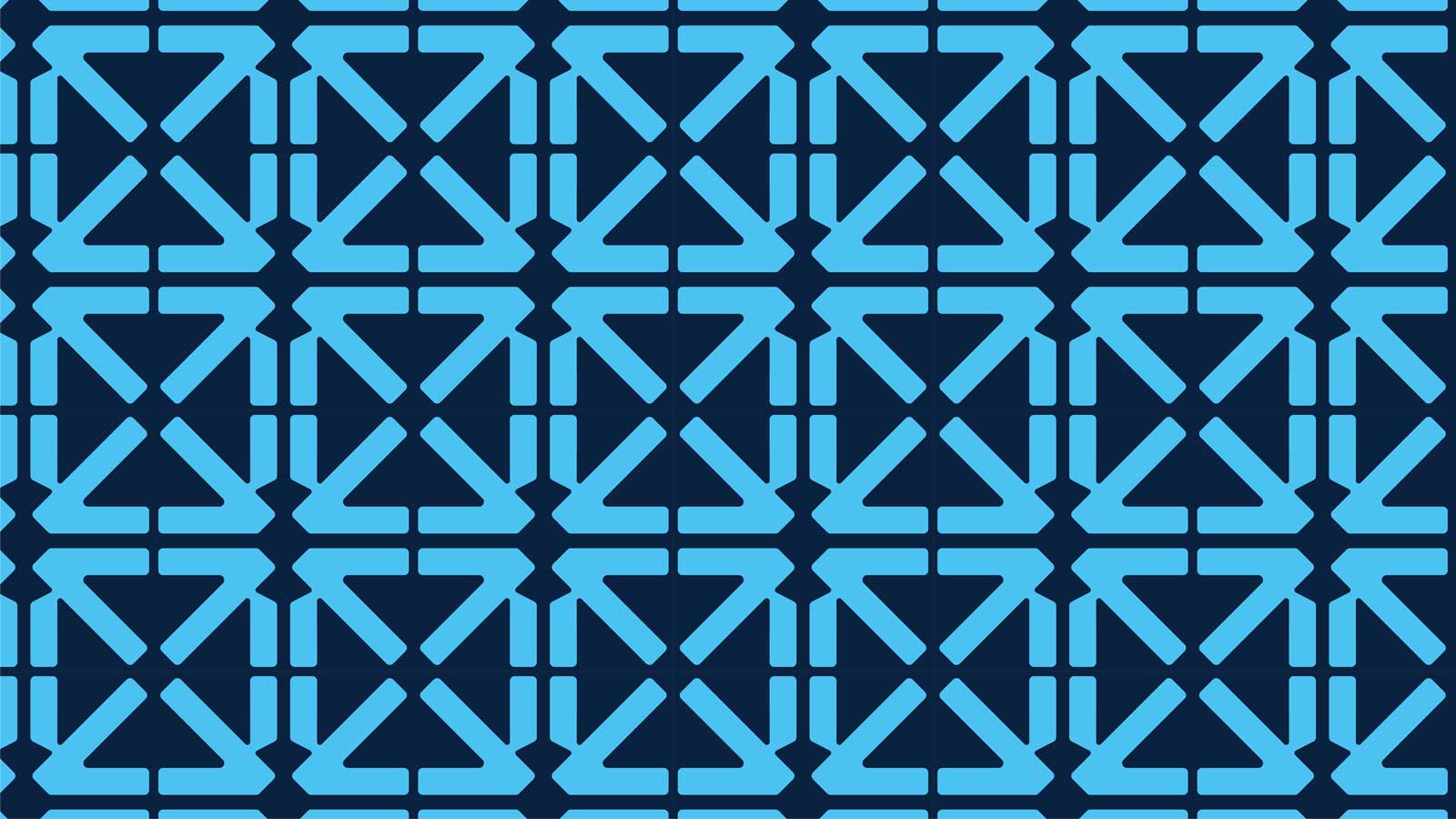
visual assets
Armed with initial shapes and ideas, we entered a phase of design iteration.
Every line and shape was refined to symbolize the harmony of contrasting forces.
The evolution led to a comprehensive set of visual assets: from a striking logo to a vibrant color palette and modern typography, each element was designed to create a part of Raul’s visual language.

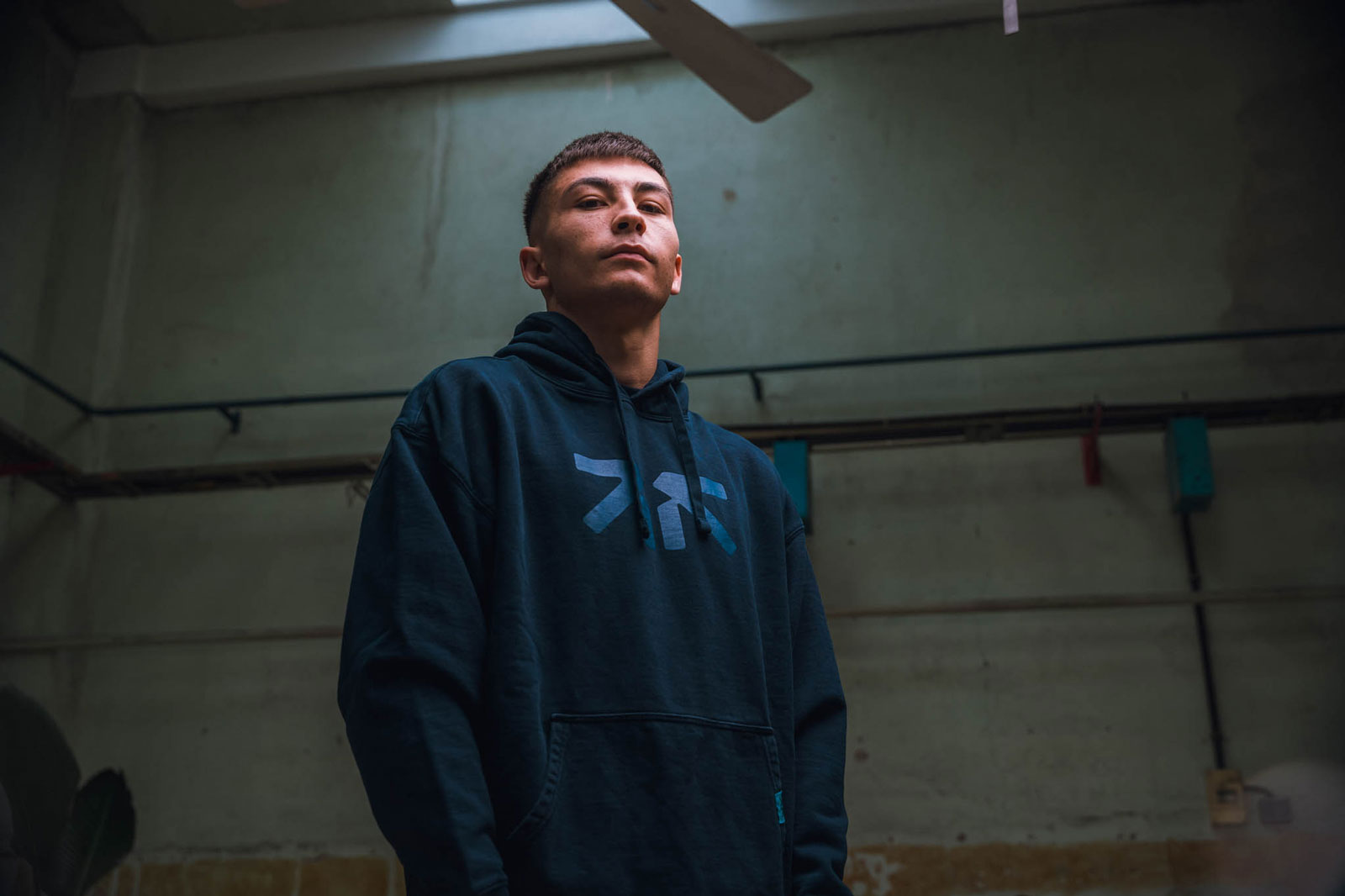
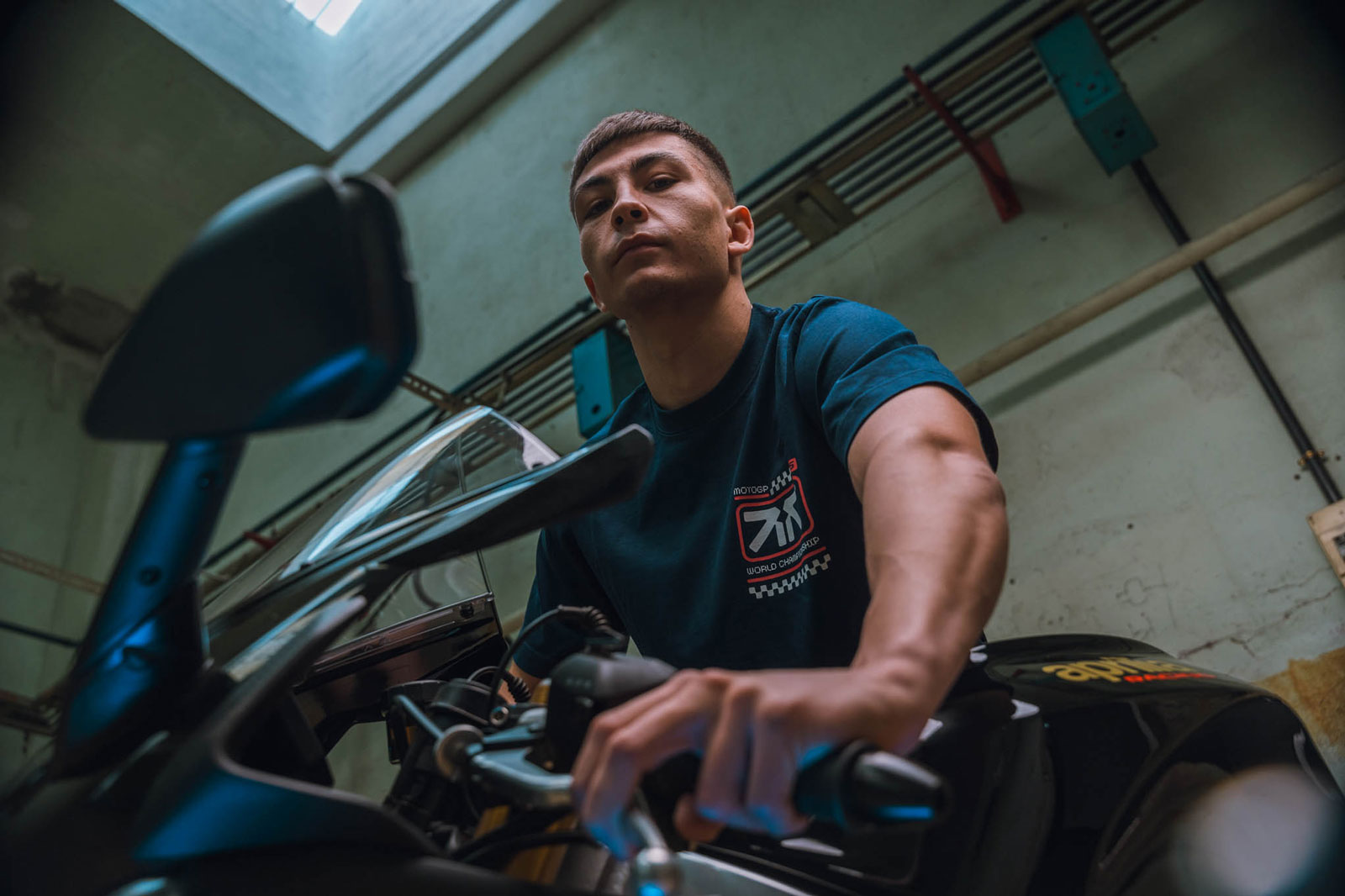
merchandising design
The identity then leaped off the screen into the physical realm.
We translated the brand’s essence into a range of merchandise that fans could wear with excitement, in and out the circuits.
the design process from apparel to accessories has been followed by full support on production and strategy for the online and offline retail.

digital design and e-commerce development
Next, we built the digital world of Raul Fernandez. The website was designed with a clean, engaging interface that not only showcased his journey but also offered seamless global e-commerce functionality.
This platform became a gateway for fans worldwide to connect with his brand, shop exclusive merchandise, and stay updated on his latest races.

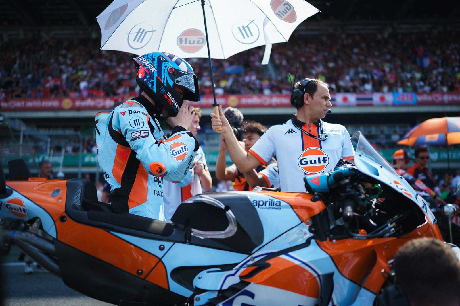
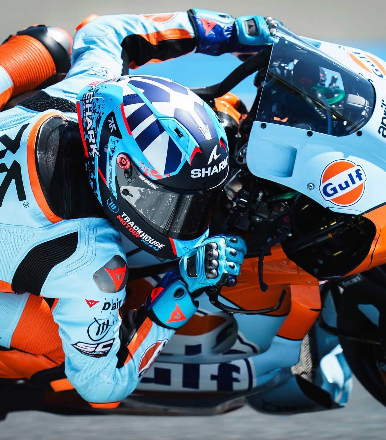
the helmet design and the social media launch
A vital extension of Raul’s identity in the high-octane world of MotoGP.
We designed a helmet that integrates the brand’s visual language, ensuring racing meets style.
the helmet design was made in collaboration with SHARK HELMETS and CSD for the painting.
The social media launch and the reveal brought together all elements of the project, engaging the global motorsport community with immersive content and interactive experiences that celebrate the balance of opposing energies.