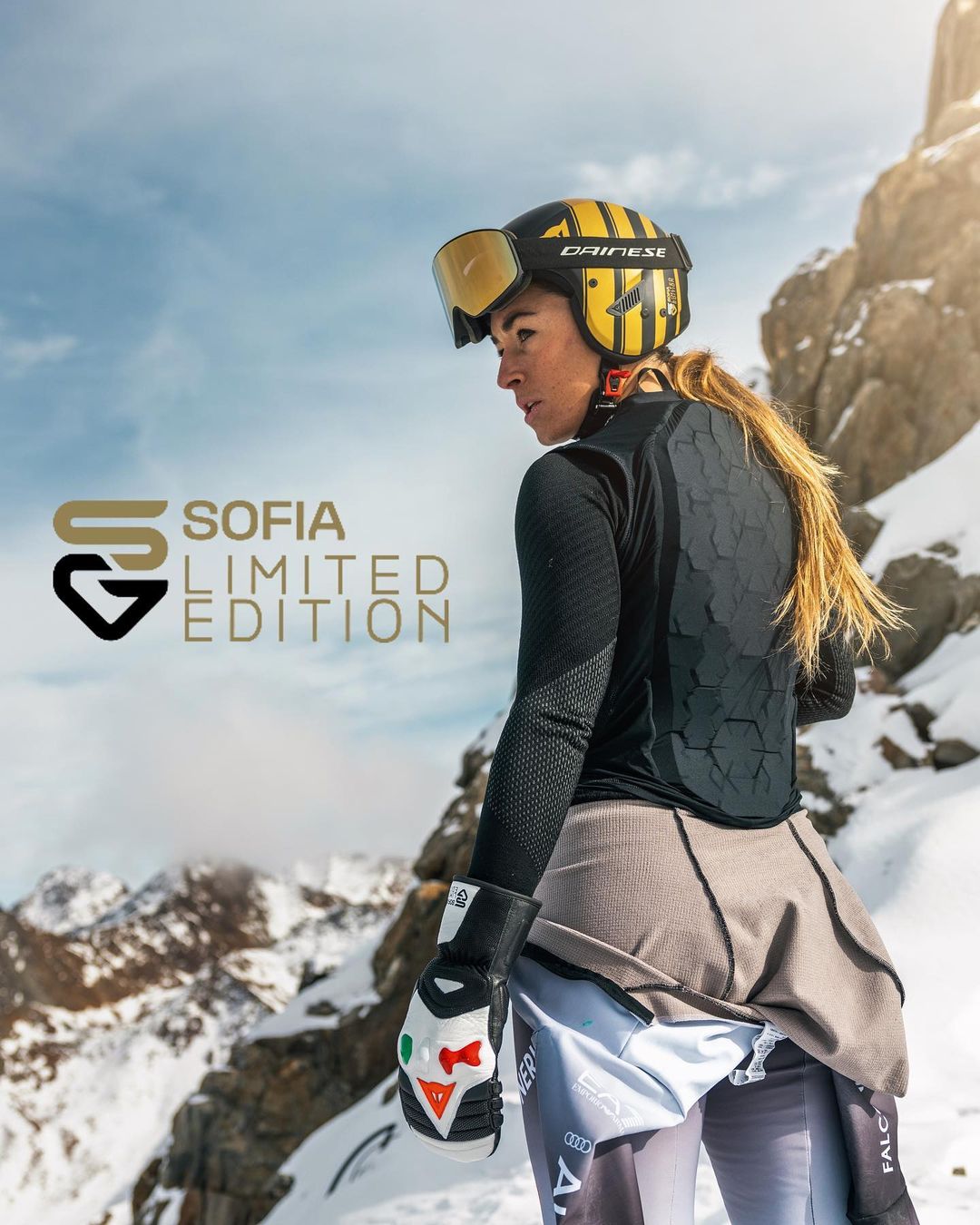
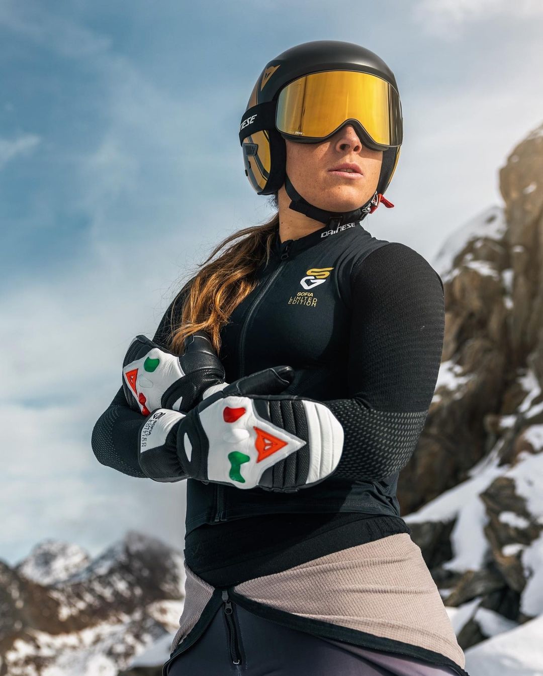
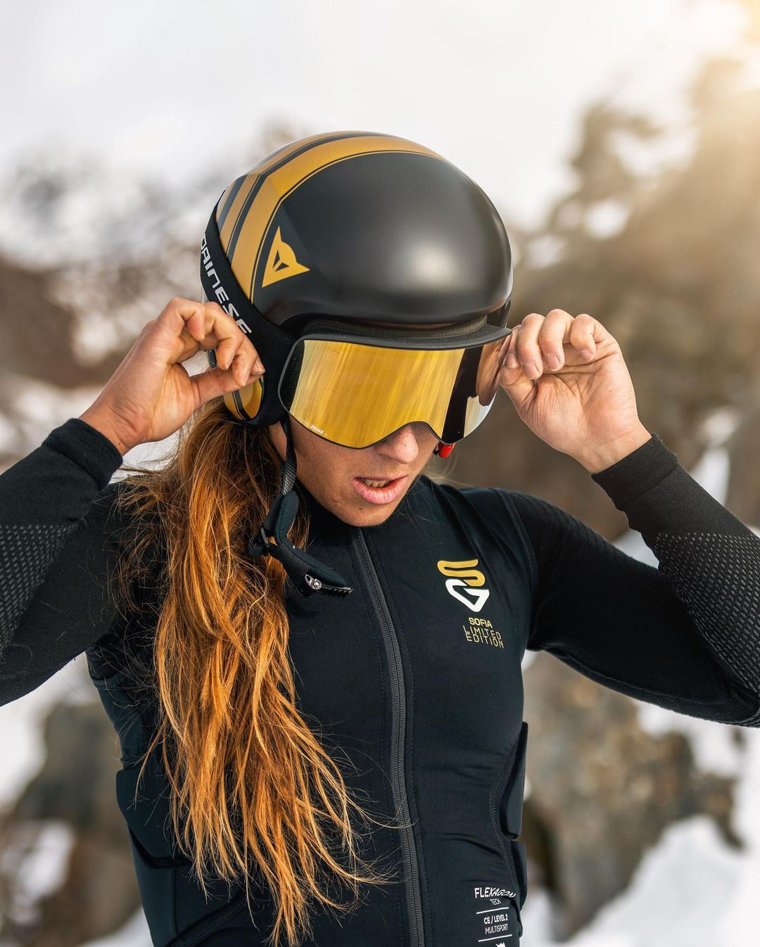
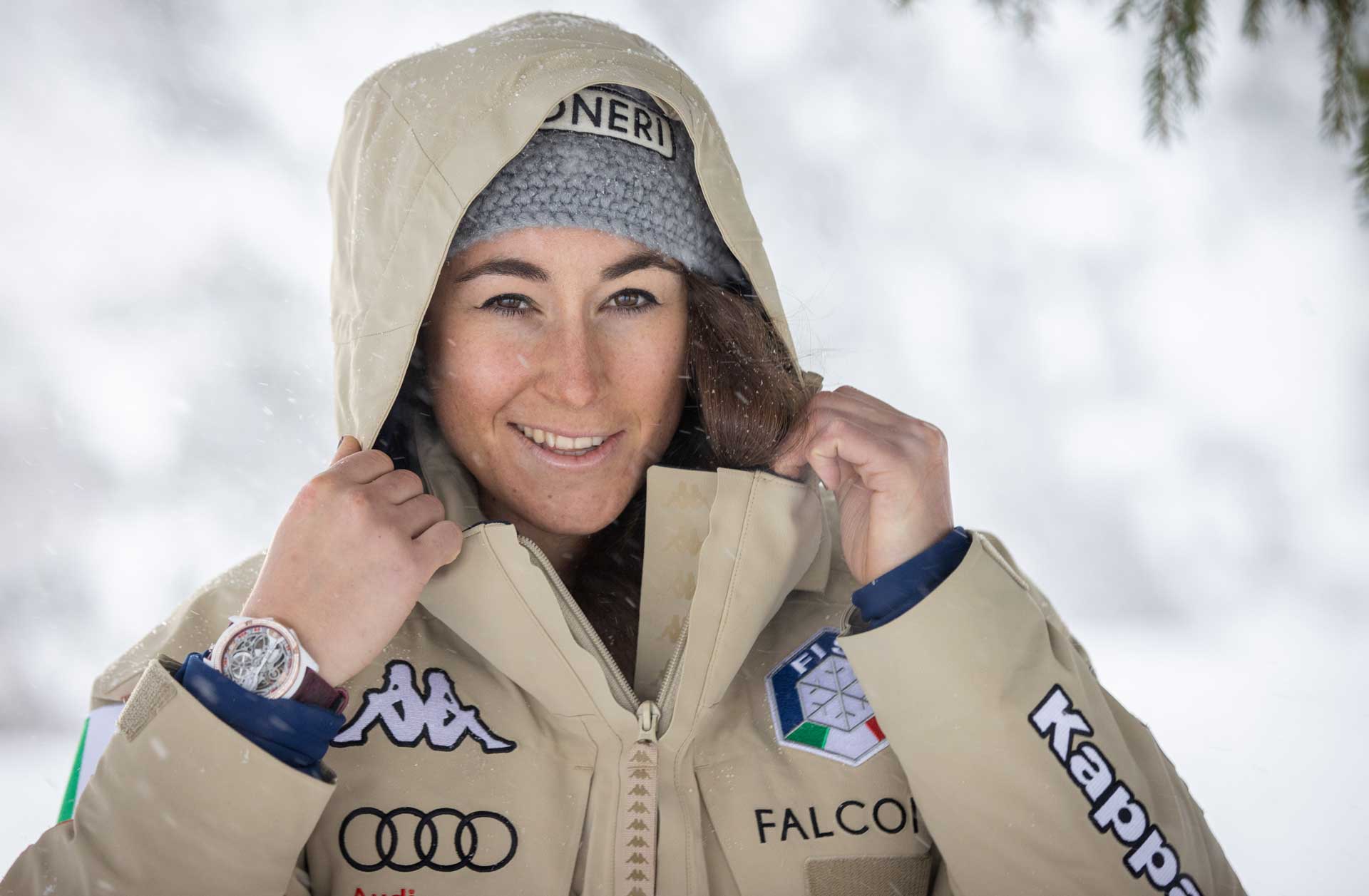
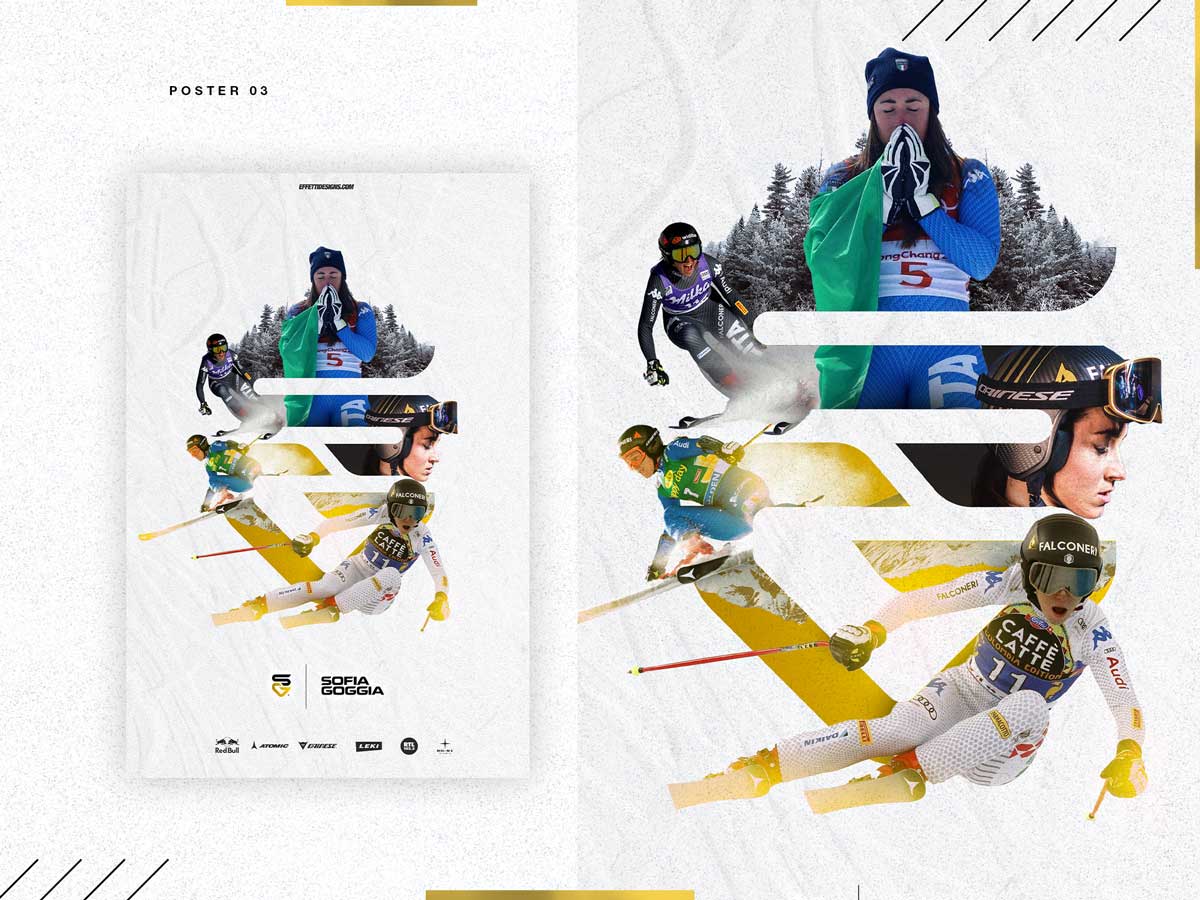
sofia goggia
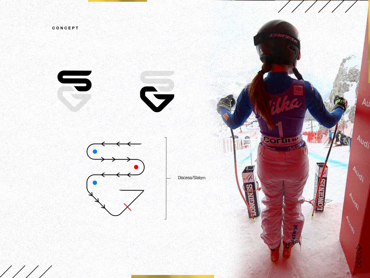
uncovering the slalom gigante in her name.
project overview
For alpine ski champion Sofia Goggia, we created a visual language that blends intensity, control and personality. Through his personal brand design, we visually represented her fearless approach to competition.
deliverables
- visual identity
- graphic design
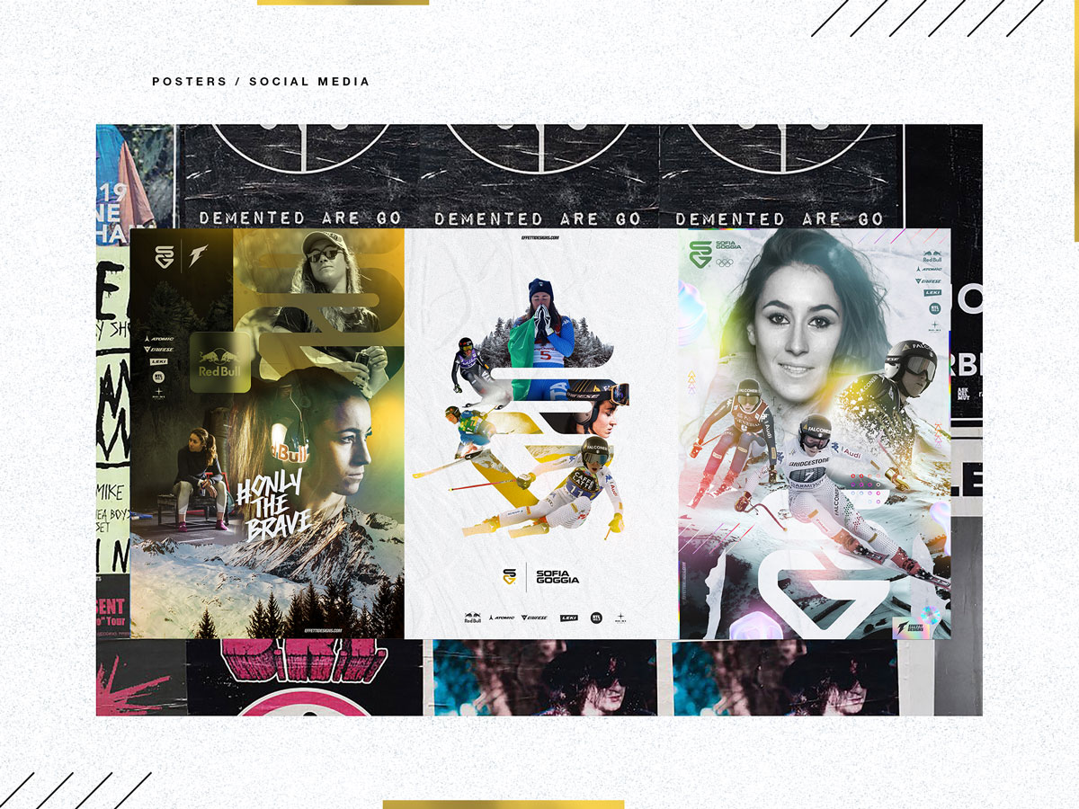
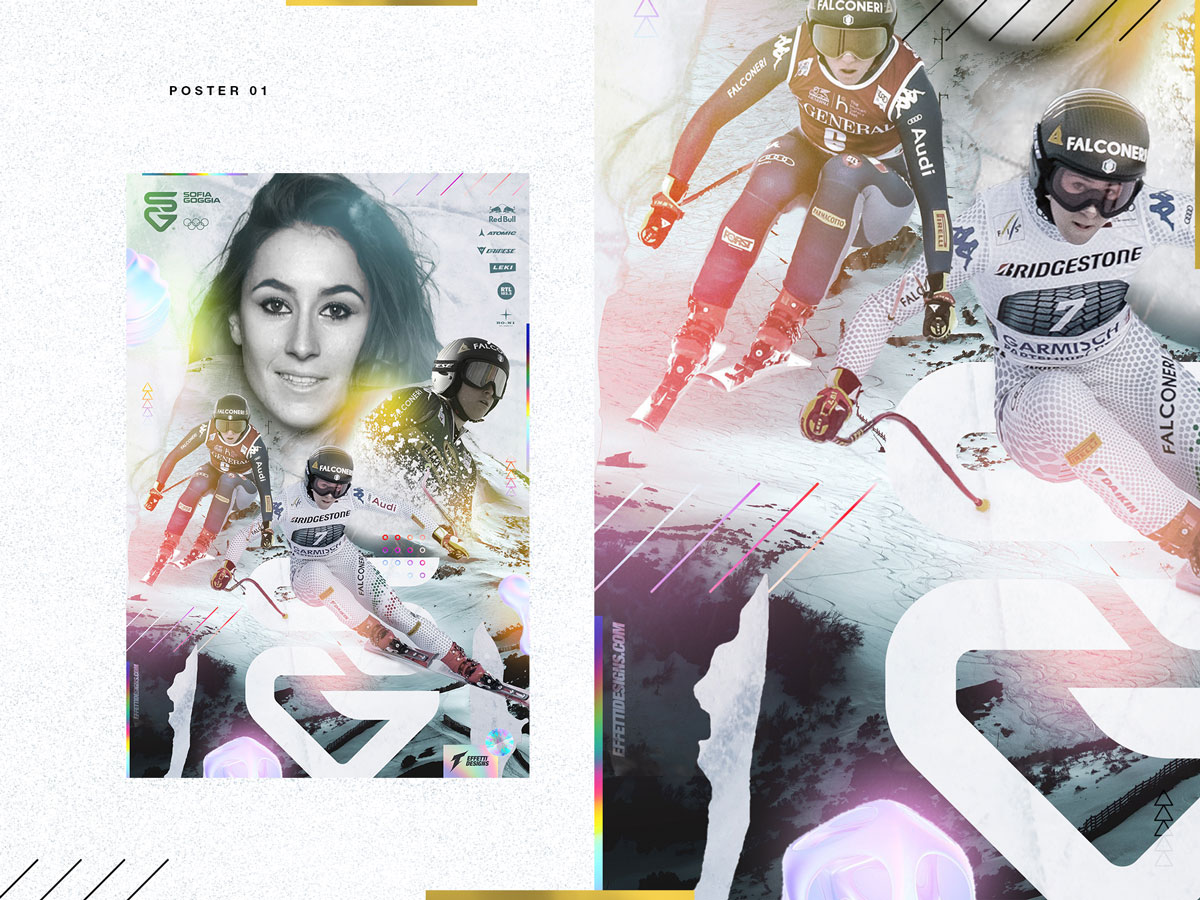
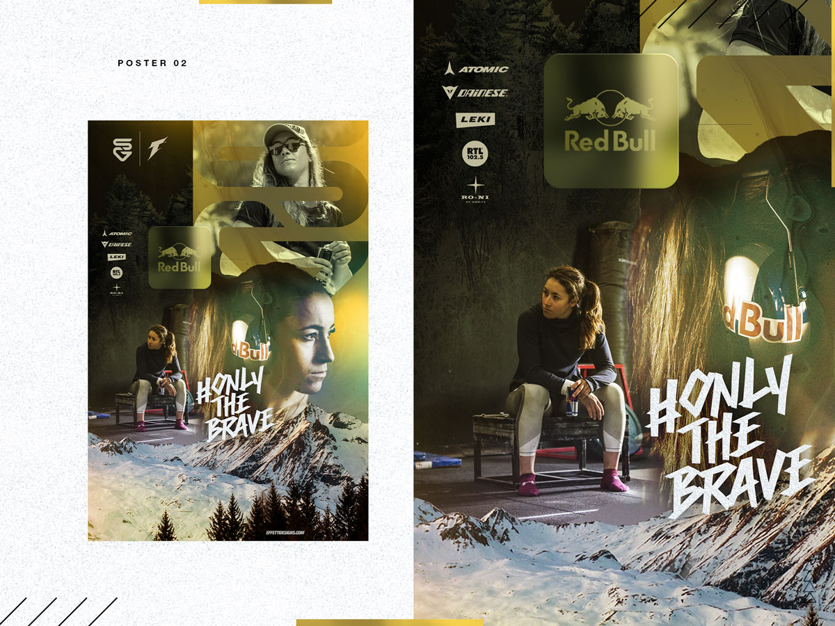
- social media content
logo design
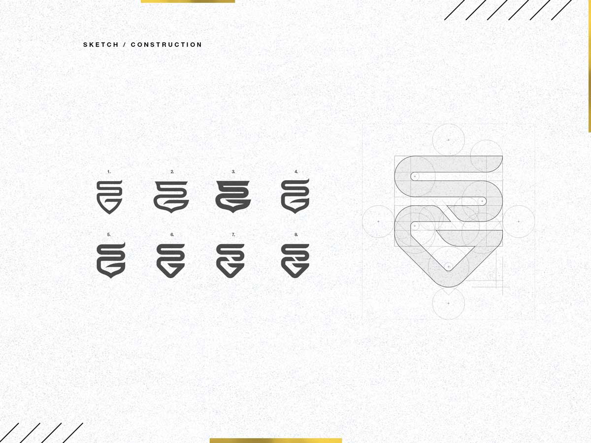
The project started with the exploration of the SG letters, here's the first sketches.
color palette
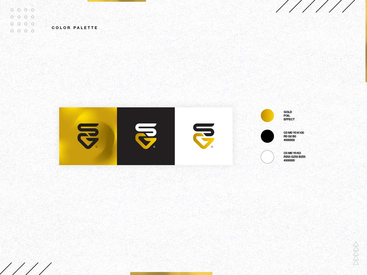
The color scheme of Sofia’s identity has been chosen by herself, she chose Gold has the color that more represent her values as an athlete and his success.
typography
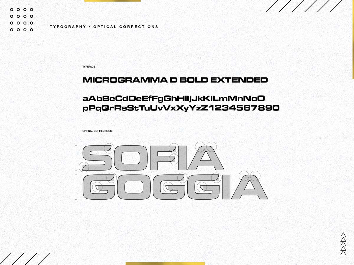
The typeface has been restyled in some key points to make it smoother and consistent with the logo.
concept
The SG monogram creates the slalom gigante course that Sofia faces every race weekend.
challenges
solutions
Sofia is followed and supported by international brands such as Redbull, Atomic, Dainese, etc.
the logo is ready to be placed alongside for any type of collaboration.
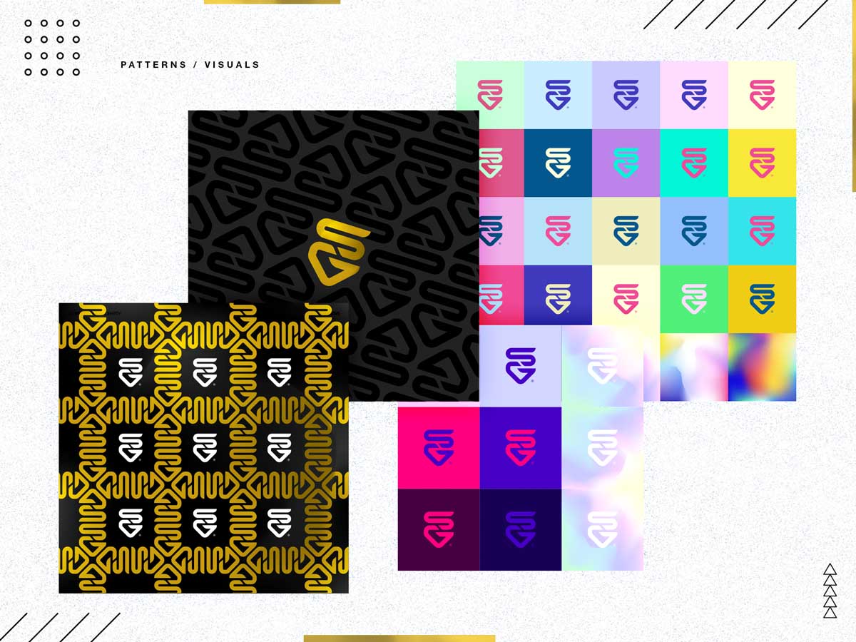
exploration
We have explored different textures where the logo and color are leading to always create new solutions and visuals.
sg x dainese
lorem ipsum